Test Your Skills 4
Test Your Skills
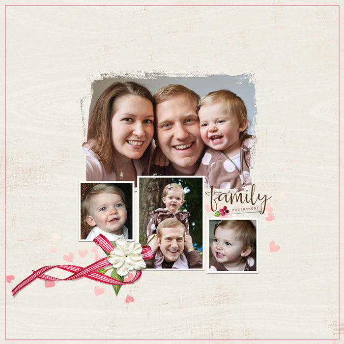
It’s time for another mask challenge! Take a look at this scrapbook page and see if you can think of ways to improve it. Once you’ve made a list of good and not-so-good points, click the button to see my assessment.

Good Points:
- These are great family photos and most of them look good in a mask.
- The background paper goes well with the pink in the little girl’s outfit. The color is a little strong for a background paper, but it might work just fine, and at least it isn’t patterned, which would be worse.
- The stroke outline gives some structure to the page.
Problems:
- Lack of Proximity: When I look at this page it feels random to me. Photos, are scattered randomly around the page to fill the space. Random filling of space is one of the biggest problems a new scrapbooker has to overcome. I know because that’s where I started. To design beautiful pages use the principle of Proximity.
- Trapped Space: Using multiple masks almost always creates trapped space because of the various shapes of masks. It’s hard to line them up in a way that avoids trapped space.
- Elements: The placement is somewhat random and the elements appear small compared to the rest of the page. In other words, the proportion is off, so it feels like elements were tossed together just to have something on the page.
- Drop Shadows: It doesn’t look like the elements have a drop shadow, which they should since they’re 3D elements.
- Stroke: The stroke does give some structure to the page. Usually, though, I like to see a thinner stroke outline, not a heavy border. This one skews a bit to the heavy side.
- Type: The type is angled (something to avoid) and has too much space between the top and bottom word. It uses the font Papyrus, which shows up prominently in online lists of the “Ten Worst Fonts For Design” made by professional designers. My opinion is that Papyrus isn’t horrible but it isn’t beautiful either. Why use it when there are so many better fonts to use?
Let’s hide the stroke, title, and elements and work on the photos.

In general it’s best to have one photo mask per page. There are some exceptions, but it takes a lot more effort to design a page with more than one mask. Instead, choose one photo that will be the main focus and use your mask with that one photo. Not every photo works well clipped to a mask, so choose wisely.
Then take the rest of the photos and use the rule of proximity to connect them to your one great mask photo.

Better—yes? But it could be even better.
We have one great mask as our focal point. (I used the Transform tool to adjust the mask so it fit the photo better.) We have three rectangular photos that are in proximity with the mask. Notice that I decided not to use one of the photos. It was a family portrait, but it wasn’t as good as the one I chose for the mask, so I eliminated it.
It’s Okay to eliminate photos that don’t really improve your page. I give you my permission to do so. What would you do to improve this photo arrangement?

Here are my tweaks:
- I brought the rectangular photos into proximity with each other while keeping them connected to the mask.
- I added a stroke outline and drop shadow to the rectangular photos.
- I reversed the position of the two outer rectangular photos so the girl is looking into the page instead of outward.
- I decided to move the 3rd photo on the right down a bit and add the title in the space created between the photo and the mask.
- For the title I used a beautiful calligraphy font (Caleigh) for the main word “family.” (There are plenty of free fonts that are similar to this one.) I also put the second word on a photo strip and used a contrasting font, Orator Std. These two fonts are currently my favorite font combo.
- While I don’t recommend angling regular type, it’s perfectly fine, and often more effective, to slightly angle a journaling tag. I added a custom shadow to the tag and a very small flower and leaf on one end. Small is OK here. It fits the tag proportionately.
- And finally, I added a heart scatter element behind the title and changed the blend mode to soft light. Here’s a closeup of the title.

I selected all the photo and title layers and transformed them to be smaller. After checking both sizes several times by undoing and redoing the transform a few times, I decided that I really liked the smaller grouping. It provides more “white space” which allows me to focus better on the photos. And at the full 12x12 inch size, the photos are plenty big.

I changed the background paper and added a cluster and stroke outline and added more heart scatter elements, using a Normal blend mode on all of them because of the light background paper.
Here are four contestants for finalist. The only difference is the stroke outline size and placement, and on two of them I moved the white paper up to show a thin strip of paper at the bottom.
Which one would you pick?
Click on thumbnails below to see larger images


I chose the medium small stroke outline with a thin strip of pink paper showing at the bottom. The stroke framed the photo group nicely leaving some space around it. This is not considered trapped space. It’s more of a design device to focus your attention, similar to how a wall frame and mat help you focus on the picture.

My second choice would have been the large thin stroke outline.
I didn’t care for the smallest stroke outline (too close to the photo grouping) nor the large thick stroke outline (too heavy).
We have one more thing to do. I decided to put a date on this layout, but where to put it?
Here are four possible ways to display a date involving the upper left and lower right corners. (I tried putting the date near the stroke outline and didn’t like the effect.)
Which one would you pick? And why?
Date and cluster in the lower right corner:

Date and a few hearts in the upper left corner:

Date and hearts in the upper left corner and flower cluster in the lower right corner:

Hearts in the upper left corner and date and cluster in the lower right corner:

Here are my thoughts as I tried out each possible location for the date. None of the locations were “wrong.” It’s just that some locations were better for the “flow” of the page.


Here's where we started:
And here’s where we ended up:
Takeaway:
- Avoid using more than one photo mask unless you’re more advanced and can pull it off. Multiple photo masks are a breeding ground for trapped space!
- Random is not a design.
- Proximity, proximity, proximity. (It’s the opposite of random.)
- Keep elements in proportion to the page and photos. Avoid making them too small or too big. Small is OK for an element on a small object, like a journaling tag.
- Think about the flow when you place your elements. The best outcome is when the flow leads your eye to or through the main photo!
Credits
Photos and page by Linda Sattgast
Template: Class/Template: QwikLearn-Design Beautiful Pages
Kit: Dear Mom by Kristin Cronin Barrow
Fonts: Caleigh and Orator Std
Brought to you by Linda Sattgast