Test Your Skills 2
Test Your Skills
Digging Deeper With Photos
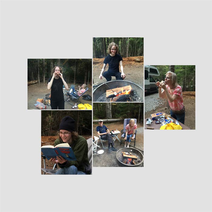
In this challenge we’ll focus on photos. Here’s the start of a scrapbook page using photos that I shot with my iPhone on a family camping trip.
Challenge: Name the Number 1 No-No on any scrapbook page that’s already apparent on this page. How would you address this problem?
SEE ANSWER
The Number 1 No-No is poor photo quality—usually photos that are too dark.
There are all the photo problems mentioned in the Design No-No’s PDF:
- Photos are too dark
- The horizon line is crooked
- Photos are too saturated
- Photos don’t match in color
- Photos don’t fill a mask
- Photos that would look better cropped
- Lacking photo definition on overlapping or clustered photos
But notice which photo no-no is at the top of the list. Uh, huh. “Photos too dark.”
Sometimes it’s just one photo that’s too dark. Other times the whole shootin’ match is dark, which is the case here.
Let’s fix these photos, shall we?
SEE FIXED PHOTOS
There! That’s better!
Knowing how to fix photos is definitely a skill that must be learned. There are some auto fixes you can use in Photoshop and Photoshop Elements, and sometimes they’re good or at least make the photo look better.
I rely heavily on the actions I created for my class Fix Photos FAST. So if you need help fixing photos, consider taking that class.
Challenge: What two things NOT listed in the No-No’s might be considered a problem?

SEE ANSWER
Problem #1: The lower left photo is facing away from the other photos. Best practice dictates that photos usually look better facing inward.
In situations like this you can sometimes flip the photo horizontally, but in this case my daughter is reading a book with words visible on the cover, and flipped words won’t fly.
Another option is to switch locations with another photo, which is probably what I’d do here, but…
Problem #2: The photo in the lower left corner doesn’t fit with the rest of the photos. Yes, it’s on the same camping trip, but all the other photos are about roasting marshmallows and this one is about reading a book.
SEE ANOTHER EXAMPLE
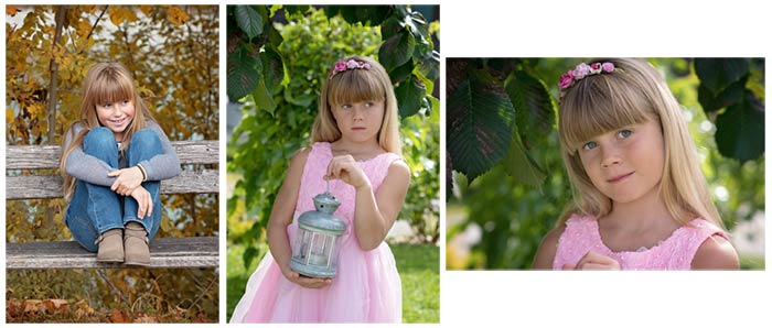
Challenge: Which photo doesn’t fit?
If you guessed the left photo, you’d be correct. Even though all three photos are of the same girl, the subject matter on one photo doesn’t fit. Will your journaling be about the summer birthday party she went to or her visit to a park in the fall?
So make sure that all the photos on a page fit your page topic.
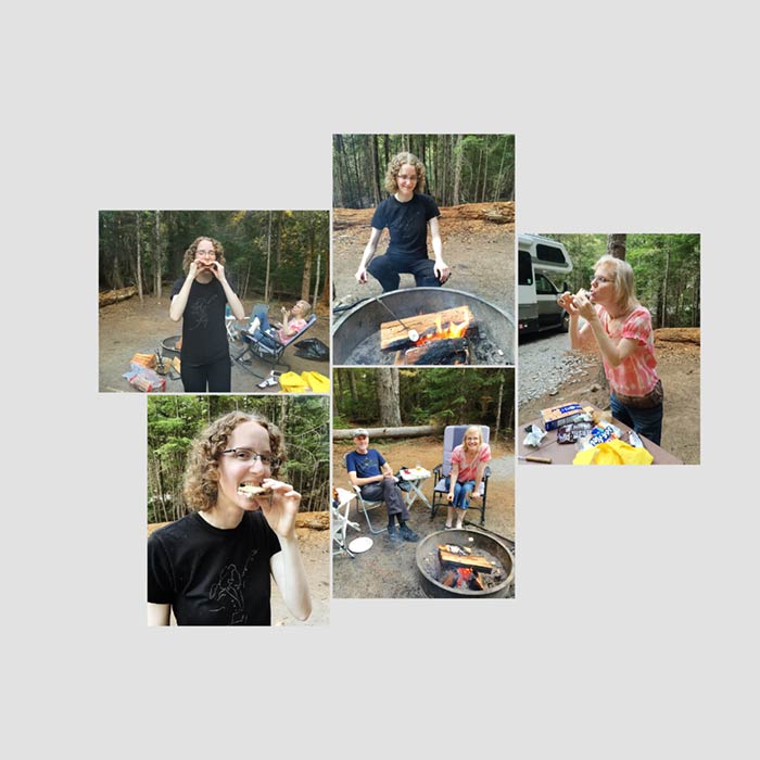
SEE MY PHOTO SOLUTION
Back to my camping photos. Here’s how I fixed the problem. I simply chose another photo that showed Allison about to bite into her S’more.
By the way, if you’re not from the U.S., a “S’more” is a hot, sticky, roasted marshmallow placed between two Graham cracker squares along with a piece of chocolate. Aaaaaahhh.
Challenge: Is there anything else you could do to “plus” these photos before moving on to the rest of your page design?
SEE MY ANSWER
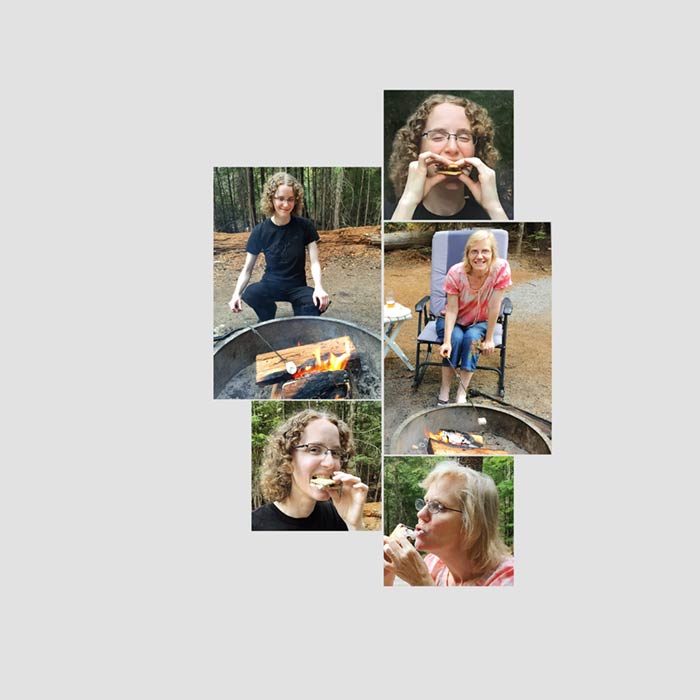
You can zoom in to the action. Here’s what I did:
- I changed the rectangular clipping mask on three of the photos to a square and zoomed the photo way in to show just a head shot of someone eating a s’more.
- Because of the change in size I rearranged the photos to fit better.
- On the rectangular photo where I’m roasting a marshmallow I zoomed in to show only the half of the photo with me on it. My husband Charlie wasn’t roasting marshmallows, so there was no need to show him in the picture, and this allowed the photo of me to be a little larger.
What can you learn from this
You don’t have to show the entire photo to get the story across. You’ll often see the story better by showing only part of the photo. Another option is to show the same photo twice but focus on a different subject or person in the photo.
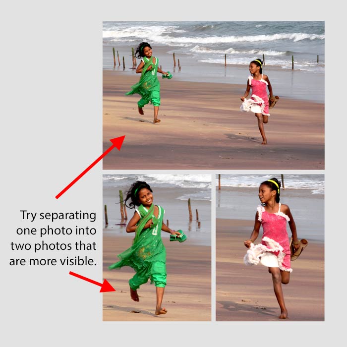
SEE MY FINISHED PAGE
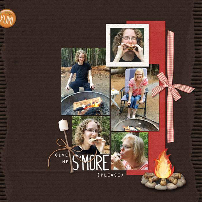
Here’s how I finished my page. I hope I’ve inspired you to take a closer look at your photos, first by making sure they look as good as they can and then by showing only what actually advances your story.
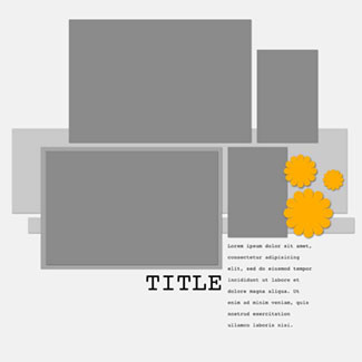
Even if you create your own grid you can look at the uneven grid templates in the classroom for inspiration for the background. Can you see how I used this template to inspire the paper strip and ribbon behind the photos on my page?
Credits
Photos by Charlie and Linda Sattgast
Page by Linda Sattgast
Template inspiration: Design Beautiful Pages
Kit: Natures Playground by Kim Broedelet
Fonts: Orator Std and Horizon Bold

Wrap Up:
- Your photos are the most important asset on your scrapbook page. Make sure they look good. Learning how to fix your photos is the single best way to improve your pages!
- Make sure every photo fits the topic of your page.
- Don’t forget that you can zoom in to a photo for clarity and interest.
Brought to you by Linda Sattgast