Test Your Skills 1
Test Your Skills
Blending Experiment
Blending is a lot of fun and full of surprises. You never know just quite what you’re going to get! As I started working on this challenge, my mouth actually flew open in surprise at one point. (I’ll tell you when that happened a bit later.)
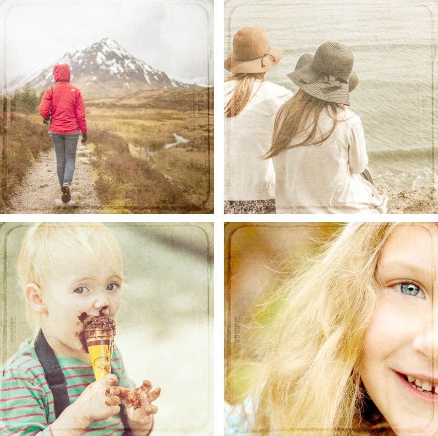
So let’s do some experimenting. All blending starts with a good photo, right? So let’s start by choosing a photo. I purposefully chose only photos with people to narrow the possibilities down a bit. Also you need to know that the image I choose will fill a 12x12 scrapbook page so I can create a fully blended page.
Question
Which of these photos would work well as a fully blended scrapbook page? Why do you think so?
Should any of these photos be avoided, and if so, why?

SEE MY ANSWER
These are the only two I would avoid. A fully blended photo should have some sort of mood to it. In general, avoid family portraits (top right photo). A portrait is a picture of your family as it really looks. It’s not meant to be turned into art, nor does it usually look good if you try.
The bottom middle photo is also not a great candidate for a fully blended page in my opinion. You might even call it a family portrait action shot. Yes, it’s possible to create a blended page with this photo, but it would probably be more difficult to pull it off. It might work well for a different kind of blending, such as masking and clipping masks.
You may wonder why I included the bottom right image. She’s staring right at us and smiling and she fills most of the photo. But there’s something fascinating about this photo. I react to it on an emotional level, so that makes it a good candidate for a fully blended page.

Question
Of the four photos that would work well for blending, which photo would you be inclined to choose to create a blended page?
SEE WHAT I PICKED
I picked all four! At this point I wasn’t quite sure which one would be my “final” image, so I decided to work with all four. Since the photos weren’t square I had to decide how to crop each photo for maximum impact.
Question
How would you arrange each photo within a square for maximum impact and pleasing composition?

SEE WHAT I DID
Be aware of the composition when you fill a scrapbook page with a photo. Placing a person along a line of thirds (where the photo is divided into thirds vertically and horizontally) is usually better than placing someone in the middle.
It’s also OK to cut off part of a person’s face as I did with the smiling little girl. In fact, I tried placing her in the center where all her face showed, and it wasn’t nearly as interesting.
Now we’re ready to try out some blending, but I still have four images.
Question
What could I do to quickly try out blending on all four images?

SEE MY QUICK BLENDING METHOD
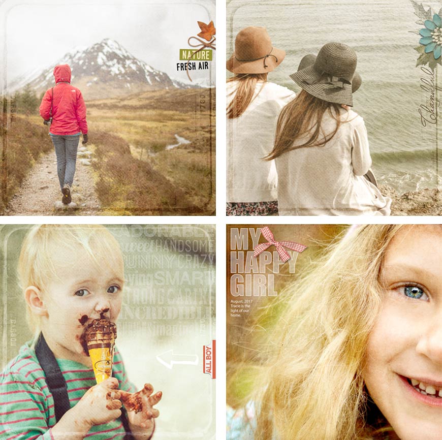
Choose no more than three or four texture overlays. I chose the four textures you see here.
Move all the texture overlays into the same document along with your images. Make sure they’re above all the images.
Change the blend mode of all the texture layers to Soft Light.


SEE WHAT HAPPENED
When I changed all the texture blend modes to Soft Light my mouth flew open in surprise. I was expecting to use only one of the textures for each photo, but the effect of all four textures blending with the first photo looked amazingly good!
Here’s how each image looked with all four textures in Soft Light at 100% opacity above it.
SEE MY FINAL IMAGES
By having the textures lined up in a row above your photo(s) you can quickly experiment by hiding and revealing texture layers and photos to find out which textures look best with each image.
So that’s what I did with each photo, and here’s my result:

I left the hiker and mountain image exactly the same. I loved it, so why change it?
For the two women at the beach I removed the lightest texture, texture 10, because the image was a little too light for my taste. I left everything else the same.
On the ice cream cone image I inverted texture 14, the one with the outline, and left everything else the same. I loved the result!
For the smiling girl I hid texture 14 because the outline interfered with her face, and I duplicated texture 20 to give it a stronger effect.
Question
Which image would you pick to create your final page?
SEE WHICH ONE I PICKED
I picked all four! I just couldn’t resist. And why not? A fully blended page takes very little extra work to finish up.
Even all the words on the ice cream cone page are from a single element—a card from a kit. By changing the blend mode to Lighter Color, the dark blue background of the card disappeared leaving only the white type.
Credits
Adventure
Photo by Pexels
Page by Linda Sattgast
Texture from Design Beautiful Pages
Kit: Nature’s Playground by Kim Broedelet
Thankful
Photo by Pexels
Page by Linda Sattgast
Texture from Design Beautiful Pages
Kit: Sweetie Pie by Brandy Murray
All Boy
Photo by Pixabay
Page by Linda Sattgast
Texture from Design Beautiful Pages
Kit: All About A Boy by Shawna Clingerman
My Happy Girl
Photo by Robyn Jones
Page by Linda Sattgast
Texture from Design Beautiful Pages
Kit: Nature’s Playground by Kim Broedelet
Fonts: Impact and Myriad Pro

Blending can while away the minutes as you try texture after texture and follow rabbit trails of “What if…” thoughts, or it can be quick and easy using a tried and tested technique like this one.
Brought to you by Linda Sattgast