Test Your Skills 4

Test Your Skills
Quiz: Designing In Thirds Finishing Touches
Let’s take a look at one more Designing In Thirds page. You’ll recognize the bare bones of this page from a prior challenge, but our goal now is to gain expertise with finishing touches.
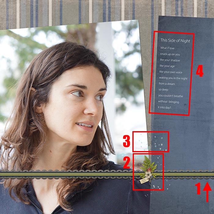
Challenge: Look at the image below to see if you agree with all the finishing touches. I can see four things that I would change. Some are No-no’s, but others are just best practice.

See the Answers

Here are my thoughts:
- This is not a “No-no” but if you recall, a ribbon is best used with classic Designing In Thirds pages where there’s a well-defined line between the two background sections. You would rarely use a ribbon across an advanced Designing In Thirds page like this one. So I would remove the ribbon.
- This cluster is too small for the photo and page. If you recall, Balance is one of the 7 Principles of good design. Another way to say it is “Proportion.” The size of any element needs to fit the page. If it’s too large or too small it registers as a mistake to the viewer. So I would increase the size of the cluster on this page to match the size of the photo.
- Placing paint over a 3D object is a no-no.
- The journaling placement is a judgment call, rather than a “no-no.” It’s properly snuggled up next to the edge of the paper, so the proximity is good, but I think it would look better on the right. Most journaling looks better straight. There are exceptions, such as when all or most items on a page are tipped, but this page has papers tipped both directions, so I would choose straight for the journaling.
SEE MY REVISED PAGE

I made my cluster quite large, but in this case the photo is huge, so it works.
SEE ANOTHER VERSION OF THIS PAGE
This is the original template I used for my page. It called for one background paper, two angled (Designing In Thirds) papers and a small photo.

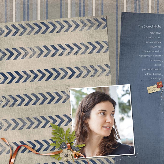
I decided to create a similar page where I more closely followed the intent of the template.
SEE MY SECOND PAGE
Notice that I made the cluster smaller for this page. It matches the size of the photo better in this size, but the cluster elements are still large enough that they look natural.

Takeaway
Watch out for No-no’s, but also make sure your elements are proportional to the size of your page and photo. Rarely do I see elements that are too big, but it’s not uncommon to see elements that are too small—even to the point where it’s hard to tell what they are in a gallery sized image.
Here are two ideas I use regularly for gauging size and overall design:
- Think of your page as a “real” page. If you were using “real” items on a paper page, what size would you expect the elements to be?
- And now for my personal secret sauce “trick” that I use with every page I make:
If you’re in the floating window view, change to a tabbed view in Photoshop Elements or press F in Photoshop to make your page the only document visible on your desktop.
Then make the viewing size of your page very small by pressing Ctrl - (Mac: Cmd -) a few times. At this small size you can see shapes and proportions much better without getting bogged down by the detail. You’ll notice if the elements don’t appear proportional to your photo. (I resized the tag on both of my page designs after using this technique and made some other changes.)
I do this several times throughout the page design process, especially when I’m feeling stuck or when I wonder if something I just did looks good. Try it. It works like a charm!

Credits
Anna Elkins: Poet
Photo and page by Linda Sattgast
Template: Design Beautiful Pages
Kit: Duty Honor Country by Etc By Danyale
Paint: from Stories 365 by Kristin Cronin-Barrow
Font: Myriad Pro Light
Brought to you by Linda Sattgast