Test Your Skills
Art Journal Quiz
It’s time to put an art journal page together! For this quiz I’m going to walk you through some art journaling design choices as I show you how I built a page from concept to finished product.
So to start, I’m creating a layout about the subject of love. One of my favorite verses talks about what love is and what love isn’t. I find the reminder so helpful that I wanted to put the words to page. I’m using one of the class templates as my starting point for this layout.
Choose A Photo
In the class video I talked about how an art journal page does not need a photo, but in this case I really wanted to use one to help portray the idea of love. In the end it wasn’t as easy as I thought it would be.
Here are three images I had narrowed my options down to:
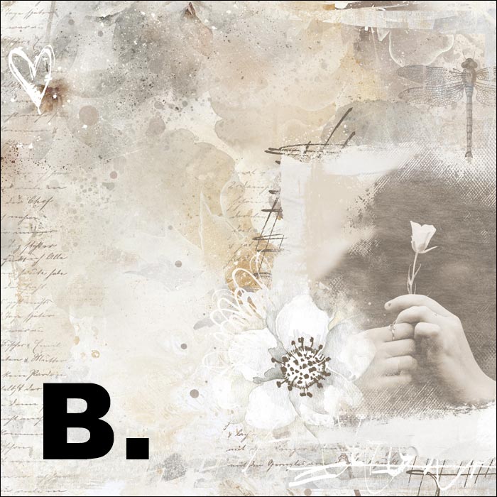
Option A: Flower
Option B: Silhouette Heart
Option C: Love Light Sign
Which one do you think might work the best?
SEE MY CHOICE
To be truly honest, none of these photos are bad, but I decided they were not equal choices.
- Opt B is the photo I really wanted to use. I love the idea of the silhouette and thought it would contribute to the artsy feel I knew my page would have. But, when I placed the photo into the mask, I found that the photo was no longer as readable as I would like. I was worried people would look at the photo and wonder what it was because the arms were cut off and not visible due to the size of the mask.
- Opt C—the love light sign photo—was my next choice. Then I noticed that the focal point of the photo was very close to the bottom edge of the photo. I knew this would present a problem when clipping it to the mask I was using (as you can see) so I went to my third option.
- Opt A—the flower image—worked better than I expected! The focal point was in the middle so it worked much better within the mask. And the idea of giving a flower portrayed the idea of love without necessarily bringing romance into it.
Choose A Background
The next design choice we have is about the background. I’ve already picked the main paper I plan to use but I had some choices on which background paper to put behind it.
Option A: Dark paper behind main background
Option B: Medium paper behind main background
Option C: White paper behind main background
Which one do you think might work the best?
SEE MY CHOICE
Option A and C again, aren’t bad or wrong. In fact, until I finished the page, I was dead set on using the dark paper. What I liked about the dark paper was that it helped give my square layout a more defined space. But the reason I chose not to use it was because even though it was helping define the space, it was also making the image feel more heavy or weighed down. Option C wasn’t used for the opposite reason. I didn’t want to use the white paper because it made my page feel washed out or lacking definition.
Option B was just right. It wasn’t too heavy or too light and it blended very well with the other paper I was using.
Choose Supporting Elements
When it comes to elements, which choice do you think best fits the style of art journaling?
Option A: More traditional elements
Option B: Stroke/paint elements
SEE MY CHOICE
While the use of traditional elements (Option A) on an art journal page isn’t unheard of, it is much less common. Using traditional elements can still be used effectively to create a beautiful scrapbook page. But if you want your page to have more of an art journal feel, using elements that are more flat in nature (Option B, like paint, pen strokes, and other artistic elements) will better achieve that look.
Choose A Title
The last design choice we have is about the font choice for the title. Which of these three do you think is the BEST choice?
Option A: Stamped look
Option B: Script font
Option C: Serif font
SEE MY CHOICE
Option C is the least appropriate option. If you are going to use a big font like this, it needs to be more on the grungy side. As it is now, this font creates a bit of a visual disconnect to the rest of the image because the rest of the image is full of beautiful, artsy, grunge.
Option B is actually an okay choice. It wouldn’t be wrong to use this one. It has a hand-written look and balances out the thin journaling font nicely. But I did feel its thin weight made it harder to see and to read. This whole page is about the word love so I really wanted to use a font that would make this word as visible as possible.
Which brings me to Option A. In the end, I chose Option A because it was visible, it had a nice grungy stamped look to it, and the thickness of the letters balanced well against the thin letters of the journaling font.
Here's my finished page:

Wrap Up
I hope this art journaling quiz has helped you get a better understanding of what to look for when creating your art journaling pages. When you’re art journaling you will have multiple good choices to pick from. I hope this process has helped you see how what you choose will add to the overall look of the page.
- We picked an appropriate photo that worked well within the size of the photo mask and also portrayed the subject well.
- We chose a background paper that complemented the main paper in a balanced way.
- We chose the right kind of elements that gave our art journal page that quintessential art journal look.
- And we also picked a title font that would be readable while still being grungy enough to match the feel of the layout.

Credits
Page by Jenifer Juris
Photo: Evan Kirby on Unsplash
Kit: Chasing Dragonflies by Brandy Murray
Extras: Art Journaling by Syndee Nuckles
Fonts: Roboto
Brought to you by Jenifer Juris