Test Your Skills 2
Test Your Skills
Become The Boss Of Blending
Whether you’re blending with textures or with one of the blending templates, don’t ever forget that YOU are the BOSS! In this challenge we’ll focus on how you can crack your artistic whip to make blending have the effect you want.
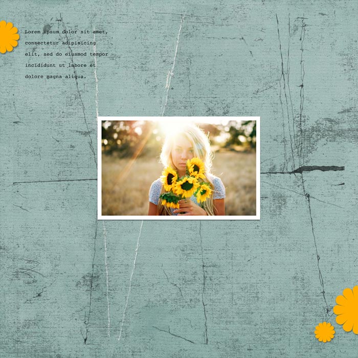
To demonstrate I’ll use a template that can be a bit challenging. It’s full of grunge, some of it quite dark.
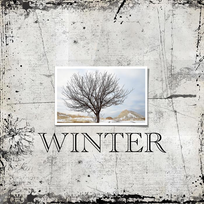
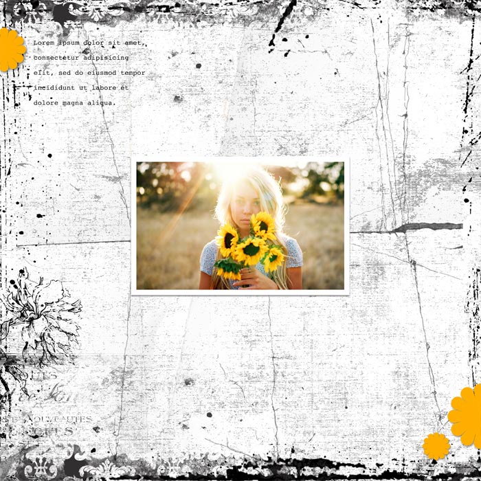
Which photo would you pick to go with this template and why?
Credits
dbp10-tem-12x12-01 revised slightly
Photos from Pixabay.com

SEE MY ANSWER
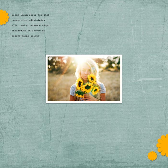
I would choose the winter image because it matches the mood of the intense grunge better than the soft, sweet sunflower photo. That doesn’t mean you can’t use this template with the sunflower photo. It just means that, as it stands right now, the barren winter landscape matches the mood of the template better.
Set The Mood
Remember that blending is a mood setter. Decide what mood you want, and then use blending to evoke that mood.
Strong harsh blending doesn’t go with soft sweet photos of people or landscapes.
Grunge that is highly visible or dark can go well with many masculine topics, like riding dirt bikes, or it can go with stark landscape photos like the winter tree or with certain city photos. It’s also a good match for competitive situations or strong emotions like edginess, anger, defiance, excitement, or dark moods.
Control The Focal Point
Even if you get the mood right, make sure the blending doesn’t take over the photo. Here’s a good gauge:
- If your eye is drawn to the grunge first and foremost, it’s probably too strong.
- If your page lacks zip, the grunge may be too weak.
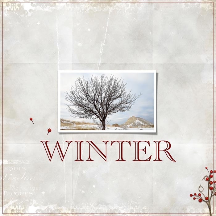
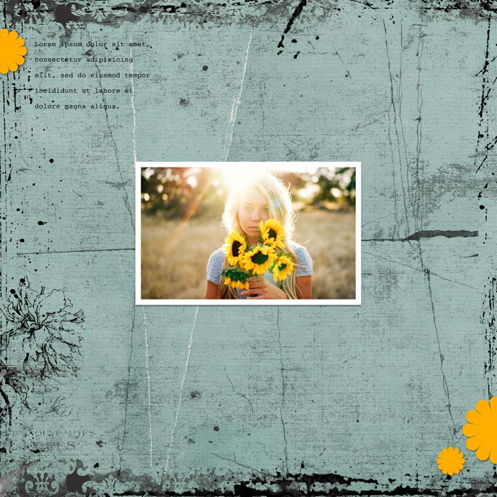
- Don’t forget that the background paper you use makes a HUGE difference. If you use paper that’s already heavily textured, you won’t need nearly as much blending, or maybe none at all.
So how do you take charge and become the BOSS of blending?
WATCH ME DO IT
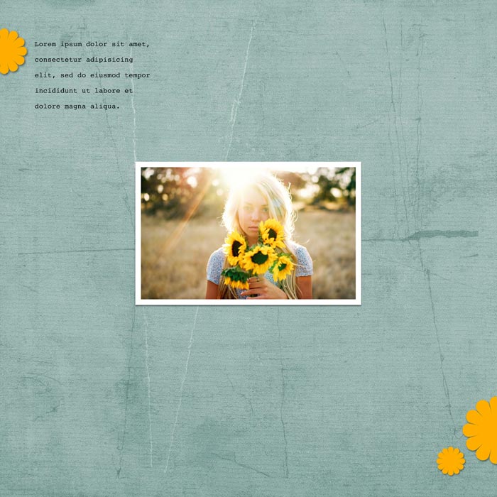
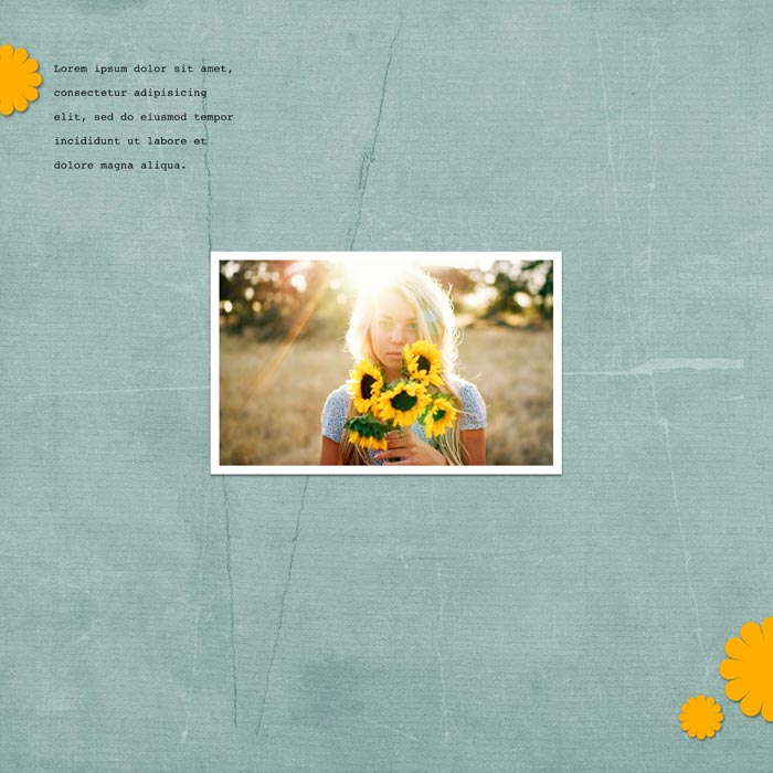
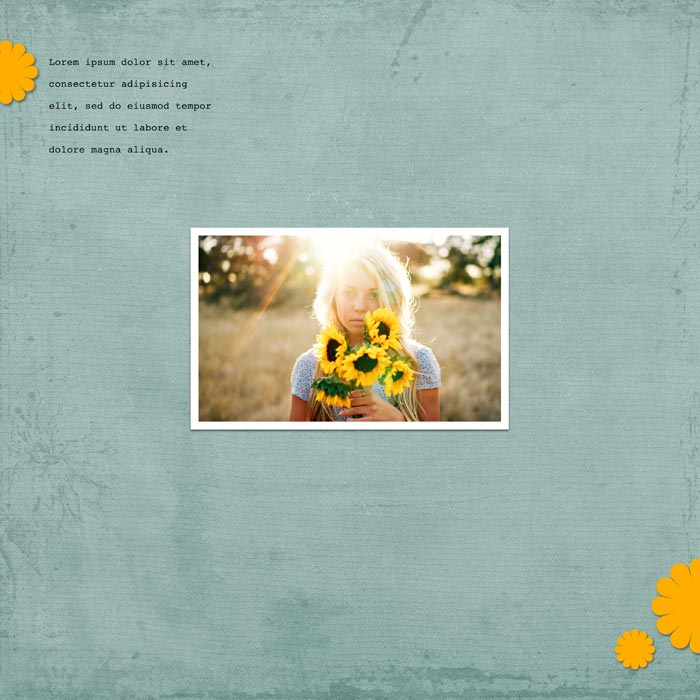
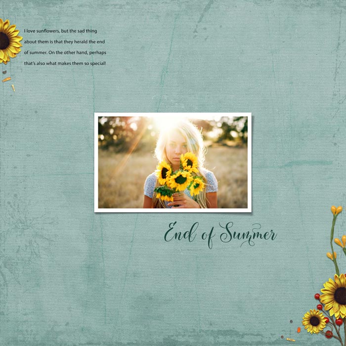
Click on the images to see how I handled different background papers. Read the caption below each image to see what I did and to read the credits.
NOTE: For all examples I’ll use:
- Template dbp10-tem-12x12-01 from Design Beautiful Pages
- Photos from Pixabay.com
- Font: Academy Engraved LET
I won’t repeat these credits for every image.
Question: How many ways can you think of to adjust the look and mood of a texture layer or template overlay?
HERE’S MY LIST
Here’s how you can control how textures and overlays look on your page:
- Change the blend mode. Don’t know which blend mode to use? Start with the tried and true blend modes (Overlay and Soft Light) and if you don’t get an effect you like, cycle through all the blend modes.
- Change the opacity.
- Invert the texture or overlay.
- Change the color or lighting. Some overlays are dark, even black. You can sometimes make them lighter if you change the blend mode, but other times you can’t. When that happens simply change the color or lighting of the texture or grunge overlay so it will react differently to the blend modes. Try a medium gray color or a color a little darker or lighter than your background paper. Keep adjusting the color until you get the look you want.
- Change the background paper.
- Mask away some of the texture.
There are probably some other methods I use that I can’t remember right now, but this is enough to get you started.
WRAP UP
YOU are the BOSS! So take control of the mood of your page by controlling the texture on it.

- Make sure your texture or overlay matches your photo(s).
- Don’t overwhelm the focus of your page.
- Use all the tricks in the book to tame those textures into doing exactly what you want them to do!
Brought to you by Linda Sattgast


