Test Your Skills 2
Test Your Skills
Photo Balance
By now you’ve heard us harp about photo quality over and over, and that’s a good thing because photo quality is VERY important.
But here’s a photo topic we haven’t really addressed specifically: Photo Balance. This idea would fall under “Balance” in the 7 Indispensable Design Principles.
If your photos are out of balance, the Mirror design will magnify the problem. This is true even if you start out with one of our awesome Mirror templates. If you don’t make sure your photos balance, your page will be in trouble from the get-go.
I’ll demonstrate good and bad photo balance by adding these two photos to three different Mirror templates.

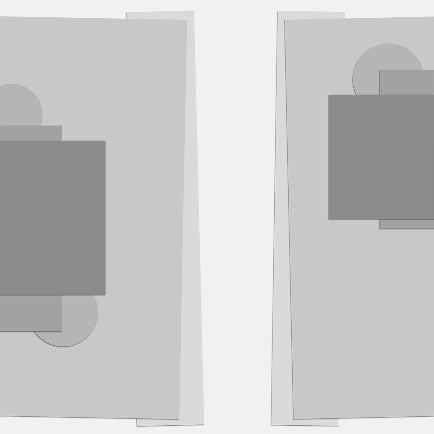
Here’s the first template we’ll try. Generally, the larger clipping mask is where you put the main photo.
This is going to be a page about Father’s Day. My main point is that Charlie is a great dad, so it seems like the focus should be on him. Also, Charlie is looking to his right, so if we put his photo in the larger template, he’ll be facing into the page, which is a good thing.

Here’s how the template looks after adding the photos.
I don’t know about you, but I see a problem with this. The photo of Charlie is dominating the page, and the photo of him with our kids is minuscule in comparison. Even when printed at the actual 12 x 12 inch size, it won’t be easy to see detail in that small group photo. These two photos are out of balance.
The zoom of the photo makes a big difference. I took Charlie’s photo zoomed in much closer than the group photo. So how do I fix this?

If I want to put Charlie’s photo in the smaller template piece I will have to flip the template horizontally, as I’ve done here, so he’ll be looking into the page.

This looks much more balanced, doesn’t it? Because Charlie’s photo is a head shot, we can easily see all the details of his face, and the group photo is now larger.
These photos are now much more in balance. But is it enough?

Here’s what happens if we zoom in a bit on the group shot. Are legs and feet really more important than the main torso? Sometimes, yes, but more often, no. In my opinion, this gives the best photo balance of all.

SEE TEMPLATE #2
Here’s the second template example. The two photo clipping masks are much closer in size than the previous example.

It would make sense to clip the photo of Charlie to the smaller mask, though, and that would make him look out of the page instead of toward the center.
What to do?

Flip the template horizontally, of course!

This looks better. But the photos are still out of balance. The photo of Charlie still dominates the page. How would you fix this problem?

Here I made the photo of Charlie a bit smaller. That definitely improves the balance. We could probably go with this view and be fine.

But what if we zoomed in on the group photo again? I personally think this provides better balance.

SEE TEMPLATE #3
Here’s the third template example. I have a nice vertical photo clipping mask for the group shot, but the small clipping mask is really small. I want Charlie’s photo to be bigger than that!

Here’s what I did: I rotated and resized the photo and one paper clipping mask on the left. I also rotated and resized the small photo clipping mask on the right.
Please remember that you’re in complete control when you use a template. As long as you keep the integrity of the template Mirror design, you can make changes that are beneficial to your photos, changes that make them balance better.

Here’s how the template looks when I add the photos. To me the photos look nicely balanced.
I decided to choose one of these three templates to create my finished page. Which one would you choose?

SEE MY FINISHED PAGE
I chose Template #3. I liked the way the lower photo was tipped to the right making Charlie look slightly up toward the group photo, and I liked the dimensions of the group photo.
Conclusion
- Watch for photo imbalance and correct it.
- A zoomed in photo will be much more readable than a photo taken at a distance, so you may need to adjust the template or resize each photo to create photo balance.
- Photos on a Mirror page design are usually tightly focused. If your photo has unnecessary space around the main focus, consider cropping it for better readability. There are exceptions to this—heritage photos come to mind—but in general, a tight focus is the better choice.
Credits

Photos and page by Linda Sattgast
Template: Design Beautiful Pages
Kit: Outdoor Dad by Brandy Murray
Type overlay: APP My Camera by Anna Aspnes
Fonts: Orator Std and Jenna Sue
