Test Your Skills 1
Test Your Skills
Want to sharpen your design skills? Try taking our quiz to see if you can spot common mistakes often seen in scrapbook galleries! Use the Design No-no’s PDF checklist to help in your search.
Quiz: Frame Design No No’s
A while back I was paddling around the brim of the lake when I came across a random hibiscus. It was so tall and proud, it appeared to be begging to have its picture taken.
Not only did I snap this little guy’s photo, I’ve put him front and center of my scrapbook page. But in my haste to get this page scrapped, I’ve made a several errors.
Challenge: Using the No-No Cheatsheet available for this class, see if you can find 4 violators on this scrapbook page.
1)
2)
3)
4)


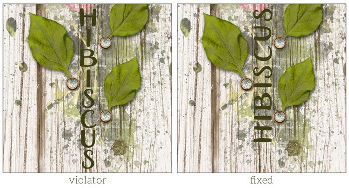
Violation 1: Type—Vertically oriented type
Explanation: Type (journaling and titles) should not be vertically displayed. It makes it hard to read and is bad practice in scrapbooking. Instead, type your title horizontally, then rotate it with the Transform options.

Violation 2: Photos—Photos that would look better cropped
Explanation: If your subject is good enough to make it onto your scrapbook page, zoom in so everyone can more easily see its details.

Violation 3: Elements—3D elements under a stroke outline
Explanation: Stroke outlines are 2D objects. In real life a 2D object cannot logically travel over a 3D object.

Violation 4: Elements—Shadowed element below graphic elements
Explanation: The diamond brad is a 3D object. The mask is a 2D object. In real life a 2D object cannot logically travel over a 3D object.
SHOW THE FINISHED PAGE
Credits
Page: Hibiscus by Jen White
Photo: Jen White
Frame Type: Outer Frame - Stroke Outline
Kit: Musings by Etc By Danyale
Font: Aristelle Sans

CONTINUE TO DESIGN CHALLENGE
Principle—The Rule of Odds
Question: The rule of odds is simply an odd number of similar things. How many things from this page can you list that would fall under that description?
Credits
Page: Patrick’s Camp Shirt by Jen White
Photos: Jen White
Frame Type: Dependent Frame - Set Apart
Kit: Effortless by Angie Briggs
Fonts: Oh wonder, DJB BEAN POLE

SEE POSSIBLE ANSWER
Possible Answers
Titles: The title on this page, Patrick’s Camp Shirt, is made up of three parts. They are totally different in form, but their purpose is the same.
Photos: Separate from the main framed photo, there are three smaller photos that are unframed.
Elements: There is one ribbon, one button, and one weedy overlay. You could even say there are three elements being used.
CONTINUE
Principle—Balance
Question: Where is the principle of balance best displayed on this page?
Credits
Page: Explore by Jen White
Photo: Jen White
Frame Type: Independent Frame—Morph
Kits: Real Life by Calista’s Stuff, Simplify by Angie Briggs
Fonts: Oh wonder, DJB BEAN POLE

SEE POSSIBLE ANSWER
Possible Answer
Balance is displayed on this page because the width of the type box is the same as the width of the stroke outline.
CONTINUE
Principle—Proximity
Question: If I were to remove the journaling from this layout, would I need to replace it with something? Why or why not?
Credits
Page: Reflection by Jen White
Photo: Jen White
Frame Type: Outer Frame—Edge Elements
Kit: Musings by Etc By Danyale, Shine by Sheila Reid (mask)
Font: DJB ANNALISE 2011

SEE POSSIBLE ANSWER

Possible Answer
By removing the journaling from this layout, a cranny is instantly created. A cranny is one of those three sided little caves that, if not attended to, will be trapped space on your layout. Something would need to replace the journaling.
Brought to you by Jen White.
