Test Your Skills 3
Test Your Skills
Taming Trapped Space & Tricky Titles
The third challenge in this series is about taming trapped space and tricky titles.
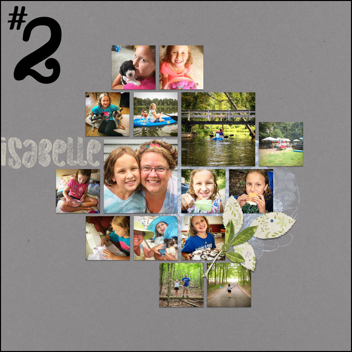
I’ll start a new scrapbook page with an uneven grid of photos.
The subject of my page will be an overview of a week I spent with my niece, Isabelle. Isn’t she a cutie?
Challenge: Take a look at this scrapbook page though the eyes of the Trapped Space Police. The goal is to catch possible violators before they have a chance to act.
NOTE: If you need a refresher on what trapped space is, rewatch the Design Basics video in the classroom.
Trapped space can be a little like mold. It can easily form in the nooks and crannies of a layout if those nooks and crannies are not properly attended to.
In an uneven grid design, think of a nook or cranny as having three sides. Kind of like a dark cave where spooky things lurk.
Can you spot two potential trouble areas in this layout where trapped space could be a potential problem?
SEE MY ANSWER
I am personally going to keep an eye on these two areas (marked in red) of my design. They both are crying out for attention. If left alone, those two nooks would feel awkward and deserted.
So, maybe you are wondering why the other outer notches (let’s call them coves) in the uneven grid design (marked in blue) are not a potential for trapped space.
SEE MY ANSWER
Two sided coves naturally form when creating an uneven grid. These little coves can be left empty and all will still be okay with the world. They make a great place for elements, titles, and journaling to hang out, but they don’t demand to be filled.
Ok, let’s get back to the original layout.
Now that the potential problem areas have been identified, let talk about what to do about them.
Challenge: Besides altering the size and/or position of any of the photos, what possibilities can you think of for filling these problem areas in order to avoid trapped space?
1)
2)
3)
SEE MY FIRST POSSIBILITY
The first possibility that came to my mind was to fill the crannies with a title and/or journaling. Making the title and journaling fill the entire space, in this case the entire height of the crannies, is the fastest and easiest solution.
SEE MY SECOND POSSIBILITY
The second possibility is to add elements and/or papers to the space. This gives the most room for creativity.
SEE MY THIRD POSSIBILITY
And, the third possibility that came to mind was adding anchors behind the photos. The anchors, which are typically 2D objects, visually fill the space and and help unify an uneven grid design.
Of course any and all of the above possibilities could be mixed and matched.
CONTINUE
I’ve decided to fill the crannies of my page with a title and an element grouping. The element grouping has already been added, but let’s work on the title together.
SEE POSSIBLE TITLES
Challenge: Study each of these examples.
- What is good about each title?
- What is bad?
- Would you use each of these titles on my page?
SEE MY ANSWERS
Title #1
The good: The title is a nice size. It balances out with the width of the largest photo. I also like the color. It repeats the blue from the anchor on the right side of the grid.
The bad: Since my page is about a little girl spending the week with her aunt, the font used in this title is way off base. It’s just not girly or femine in any way.
My opinion: This title does not fit my subject, I would not use it.
Title #2
The good: I like the font in this title. It’s grungy to match the anchor on the right side, and it’s childish which matches my subject matter. I also like the color. It matches the background color of the leaves in the cluster.
The bad: The huge size of the title is throwing the design off balance. When looking at this page, the title is the first thing I see. Unless you want the title as the subject of the page, best practice is to keep it in balance.
My opinion: This title is too big, I would not use it.
Title #3
The good: The font is girly. I like that the thin swirls in the font match the thin swirls in my anchor.
The bad: Even though the bright pink color of the title is being borrowed from a few photos, it does not match the rest of the elements.
My opinion: This title is too distracting, I would not use it.
Title #4
The good: The size of this title balances out the width of the largest photo on the page. The color of the title is not distracting and it coordinates with the rest of the elements. The font is easy to read, yet girly. The title also fits nicely inside the cranny of my template.
The bad: I cannot find a flaw in this title.
My opinion: My search is over. I’m going with this title.
SEE THE FINISHED PAGE
Here’s how I finished off my page about my adventure with Isabelle.
Creating your own uneven grid design is often easier than using a template. Hopefully I’ve given you food for thought when deciding what to do with those nooks, crannies and coves that form along the way.
Finished Page Credits
Page: Isabelle by Jen White
Photos: Jen White
Class: QwikLearn | Design Beautiful Pages
Kits: Effortless by Angie Briggs, Map Overlays Vol1 by Susie Roberts
Fonts: Amastery Script, DJB BEAN POLE
Other Credits
Kits: Effortless by Angie Briggs, Cottage Garden by Susie Roberts and Amy Davie
Fonts: Amastery Script, Myriad Pro, Mesquite Std, Old Originals, Safina Script
Wrap Up
- Nooks and crannies are bound to form when creating an uneven grid design. Make sure to treat them with the care and attention they need.
- The font, size, and color of your title are more important than you might think. Watch for violations of the seven design principles. They can make a huge impact on your page.
Brought to you by Jen White.