Test Your Skills 4
Test Your Skills
3 Simple Steps for Successful Uneven Grid Design
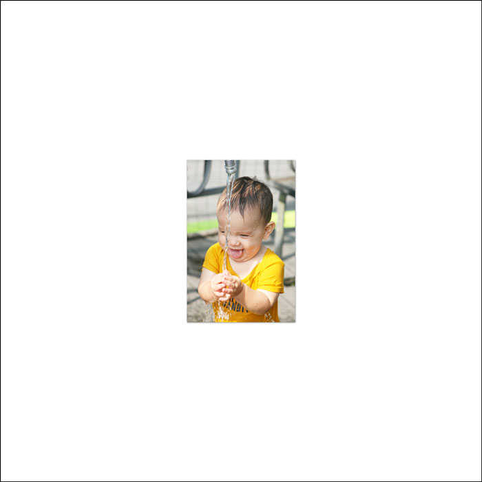
This summer my niece and nephew were here from Texas for a couple days. I took a bazillion photos of them playing in the hose and now I’m ready to create a scrapbook page with an uneven grid design.
My process is three fold. Let’s begin by unfolding the first step.
STEP ONE: Narrow Your Photos
A girl cannot possibly fit a bazillion photos onto a single scrapbook page, so I took some time to narrow my bazillion photos down to 35 of my favorites. Then, I took it one step further and pared the pile down to my top eight.
TIP: Need help narrowing your photos down to only a select group? Read 3 Steps for Narrowing Down a Group of Photos.
You may be wondering how many photos is a select group?
Tricky question. It really depends on what you are starting with. But as a rule of thumb, a scrapbook page should have a single subject.
My subject is “fun in the hose.” I didn’t include photos of them petting the dogs or running in the yard, even though they did those things at the same time they were playing in the hose.
As for how many photos, my personal rule of thumb is no more than 10 per page. Most times less is more. It’s better to have 3 AWESOME photos, than to have 15 so-so photos that all look pretty much the same.
Once you have a manageable number of edited and relevant photos, it’s time to move on to step two.
CONTINUE TO STEP TWO
Step Two: Start with a Focal Photo
Within your final group of photos you will usually have one photo that stands out from the rest. We refer to this as the focal photo.
The focal photo should be:
- the photo that encompasses the story being told
- the result of a story line
- the photo that makes you smile the most
Step two is all about finding that focal photo and getting on your page.
CHALLENGE: Take a look at my 8 photos. Which would you choose as the focal photo for my page? Why?
SEE MY CHOICE
For the focal photo of my uneven grid design, I chose photo number one.
Why? Photo number one encompasses the story for me. It reminds me of the fun time we had laughing and playing in the hose.
Truth be told, I also chose photo number one because it makes me giggle, and I love to giggle. Who doesn’t need more giggling?
I started my uneven grid design by creating a new document and placing my focal photo in the center of the page.
I also transformed the photo small enough to allow for the rest of the photos in the design—in this case, 7 more.
CAUTION: Transforming photos smaller as you design is okay, but you want to avoid transforming them larger. That will result in loss of quality. So don’t start off with your focal photo really small.
CONTINUE TO STEP THREE
STEP THREE: Add Remaining Photos
Step three is where we actually build the uneven grid design. I have 7 more photos to add to my design, but the key is to add the remaining photos one at a time and arrange as you go.
So, does it make a difference which photo goes next?
Here are a few methods you could use to determine the order you add the photos:
- Storytelling. If your photos are telling a story of events leading up to (or away from) the focal photo, then add your photos in a chronological sequence.
- Love to Like. In a large group of photos, it’s likely that you LOVE some of the photos more than others. Start by surrounding your focal photo with other photos you LOVE, then surround those with photos you like.
- Randomly. This is usually my method of choice. Once I’ve established the focal photo, I simply add and arrange them one at a time without really taking into account which should come next.
I’ll be taking the random approach with this scrapbook page.
The splashing water photo you see here is the photo I’ll be adding to my next to my design.
CHALLENGE: Taking into account the composition of the new photo and what you’ve already learned about uneven grid designs, which of these examples are good and which are bad?
SEE MY ANSWERS
Example #1 — Bad
The subject of the new photo - the boy and the water bowl—is situated on the left side of the photo. Therefore, the left side of the photo needs to be anchored against something. Instead, the right side of the new photo is being anchored against the focus photo. This would be a bad start to an uneven grid design.
Example #2 — Good
In this example the anchoring problem from example #1 is fixed. Also, the new photo is snuggled up to, but not touching, the focal photo. This would be a good start to an uneven grid design.
Example #3 — Bad
Again, the new photo is anchored on the correct side, but now the photos are overlapping. It’s not wrong to overlap photos, but all photos must overlap the same amount and that will be hard to do with this many photos. A classic uneven grid will be a lot easier, so save yourself the trouble and check it off your list of options.
Example #4 — Good
Did you count this as bad because the photos are lined up? No worries. In an uneven grid design, photos can line up as long as the final grid forms an uneven outer edge. So I’ll say that it’s okay to start with this placement, but make sure you start staggering with the next photo.
For review, an uneven grid may:
- form a grid inside where photos do not overlap.
- form an uneven grid outside where edges do not form a straight line.
My choice is to stick with the safety of example #2.
PLACE THE NEXT PHOTO
I’m now ready to move a third photo into the uneven grid design. Here are four possibilities for adding that third photo.
CHALLENGE: Which of these examples are good and which are bad? Why?
SEE MY ANSWERS
Example #1 — Good
As the properties listed above state, the inside is forming a grid with no overlap and the outside has uneven edges. This would be another good start.
Example #2 — Bad
I actually like that the subject of the new photo is facing toward the center, but the problem lies in the forming of a cranny. Remember those from the last challenge? That’s a place (typically with 3 sides) where trapped space is going to form if not taken care of. You could work with this design, but it’s going to get you off on the wrong foot, so I say avoid it.
Example #3 — Good
Again, another good start. Examples #1 and #3 are equally good.
Example #4 — Bad
Rearranging example #2 didn’t help. There is still the formation of a cranny at the top of the grid. Booo!
Get what I’m saying? Try to avoid making bad choices or you’ll spend all your time to trying to fix them later.
CONTINUE
In the interest of time, I went ahead and placed the remaining photos on the page. Here are several different possibilities for doing that without inviting trapped space.
There are literally a ton of ways this group of photos could have been arranged.
SEE MY FINISHED PAGE
As I was finishing my page, I decided to narrow down the photos even more by making my page about just one person and not two. I’ll keep the photos I did not use for another page…maybe.
Wrap Up
- Narrow your photos down before starting an uneven grid design.
- Begin the design with the focal photo.
- Add photos one at a time to create an uneven grid design that is free of trapped space or unseemly crannies.
- Following these three simple steps guarantees that you start on the right foot.
Brought to you by Jen White.
Finished Page Credits
Page: Splash, Little Man, Splash by Jen White
Photos: Jen White
Class: QwikLearn | Design Beautiful Pages
Kits: Beautiful Morning by Amber Shaw, Simple Joys by Anita Designs, Summer Chills by Vero
Fonts: Amatic SC, DJB BEAN POLE