Test Your Skills 4
Test Your Skills #4
Part 1: Photos and Morphing
Challenge: Here's a riddle for you.
What is:
- the rule most broken on the list of Design No-No’s
- but, is also the easiest problem to fix
- and, is what’s wrong with each of the photos shown here

SEE THE ANSWER
Answer: Dark photos.
We keep drilling this in because it continues to happen over and over.
It happens to me, too. I get so caught up in making my page look good that I forget to take inventory of my photos.
If this is you (and know that it’s me, too) consider taking steps to make sure it doesn’t happen again.One Solution
Edit your photos as soon as you download them from your camera. Not after you’ve put them on your page. This is what our resident photo professionals—Linda and Jenifer—do.
SEE THE DIFFERENCE
Here are those same photos with their fixed counterparts. WOW! What a difference!
Lightening a photo is SO quick and simple and it’s something that nearly EVERY photo needs coming straight out of your camera.
We want to see, REALLY see, your photos. Please, please, please, lighten them up.
Ok. Moving on.

GO TO PART TWO
Test Your Skills Part 2
Here’s another test from the list of Design No-No’s.
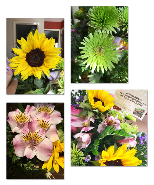
Challenge: What is wrong with this photo cluster?

SEE MY ANSWER
Answer: The photos in this cluster are “lacking photo definition.” They're all running together. At first glance, they all look like one big hot mess.
The problem is you cannot tell where one photo stops and another starts without looking twice or three times.
Challenge: If you find yourself in this situation, what are somethings you can do?
SEE MY SOLUTIONS
One simple thing you can do to create separation is to separate the photos more. This grid variation is visually much nicer, but I’m still a little wigged out by all the busyness going on.

SEE ANOTHER SOLUTION
In this grid variation, I went back to the smaller spacing but added a 35 px stroke outline in a neutral color to each photo.
This seams to help break things up a bit, but the neutral color might not be enough to create a good visual separation.

SEE A THIRD SOLUTION
The only thing different in this variation is that I’ve changed the color of the stroke outlines to a dark brown instead of creamy white. Finally I’m starting to see individual photos instead of one big pile of flowers.
Because the photos are so colorful and the background is white, the darker stroke really helps create visual separation.

SEE A FINAL SOLUTION
In this variation:
- I changed the stroke outline color back to creamy white
- and made three of the photos slightly smaller than the fourth
- I also added a frame to the focal photo in the grouping
Adding the frame not only sets one photo apart as the most important, but it also works to create visual boundaries and separation.
I’m sticking with this variation to combat the problem of “lack of definition.”

GO TO PART THREE
Test Your Skills Part 3
In the Effective Framing lessons, I talked about putting together a photo, a frame, and a mask to create what I called morphing.
The morphing technique is where a photo appears to spill out of a frame adding depth and action to a design.
GOAL: The goal of this challenge is to help you realize that you have the power and authority to place the mask in the position that best suits a particular photo. Don’t get stuck inside the box!
Take a look at these three items.
Challenge: With this particular photo in mind, where would you position the mask on the frame to make the most pleasing design?

SEE A FEW OPTIONS
All of the three examples have the morphing technique correctly applied—the mask is being used to extend the photo beyond the frame. But, only one of the three examples has the mask in the correct position.
Challenge: Which of the three examples is the best arrangement for the photo, mask, and frame combo? Can you support your answer?

SEE MY ANSWER
Answer: The middle example places the mask at the end of the action, to the place your eye naturally wants to travel.
TRY ANOTHER ONE
Here is the exact same frame and mask, but with a different photo.
Challenge: Which of the three examples is the best arrangement for the photo, mask, and frame combo? Which example gives you more (outside the frame) of what you want to see?

SEE MY ANSWER
Answer: The image on the left has the mask in the correct position. The photo is morphing out of the frame in the direction that the trumpet player and his instrument are pointed.
CONTINUE
Wrap Up
- Always take a moment to lighten your photos. If you often forget, try doing it as soon as you download them from your camera or phone.
- Busy photos often suffer from lack of definition when placed together in a cluster or grid. To combat the problem, try stroke outlines and/or a frame.
- You have the power and authority—and responsibility—to move the mask to the correct place when using the morphing technique.
Credits for Photos
Photos: Jen White, Ksenia Makagonova, Mark Tuzman, Tikkho Maciel, Yamon Figurs, Blake Verdoorn, Priscilla DuPreez
Kits: Swap Meet by Cindy Rohrbough, Capturing Moments by Angie Briggs, Junk in the Trunk by Brandy Murry

Page Credits
Page: Flowers by Jen White
Photos: Jen White
Frame Type: Dependent Frame—Set Apart
Kit: Swap Meet by Ginny Whitcomb and Cindy Rohrbough
Fonts: Chaparral Pro, DJB ANNALISE 2011, Challista Script
Brought to you by Jen White.
