Test Your Skills 1
Test Your Skills
Top Of The Stack
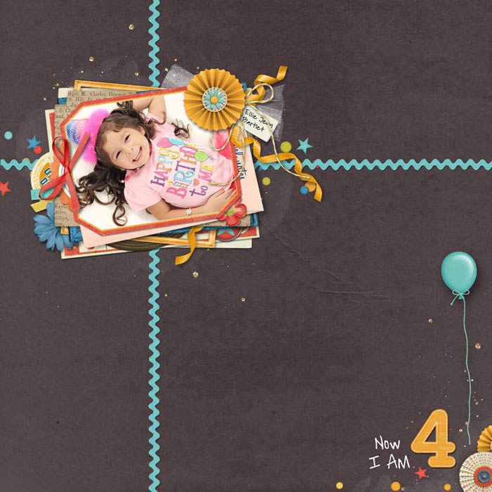
In this challenge I’ll walk you through the process of creating a Top Of The Stack design. We’ll use the birthday girl image you see here as the photo on top of the stack.
Usually you’ll start with the photo and then build the stack below it, but just for fun—and to show you it can be done either way—let’s build the stack first and add the photo last. Here’s how we’ll proceed:
- Choose a birthday themed kit.
- Decide which elements are appropriate for the stack.
- Build the stack.
- Add appropriate drop shadows to the stack layers.
- Add the photo to the top of the stack.
Question: What will you look for when choosing a kit?

SEE MY KIT
I’ve chosen a birthday-themed kit called Celebrate by Julie Billingsley.
A birthday kit seems like an obvious choice, but there’s more to my choice than just the theme.
I want to make sure the kit I choose has enough stacking elements to create the height I want and the right kind of elements to tuck into the stack. A kit with few stacking elements and an emphasis on 2D elements isn’t going to provide enough material for my stack.
Of course I can get additional stacking elements from other kits, but then my list of credits gets really l-o-o-o-o-n-g! Just sayin.’
So I prefer to start with a robust kit that lends itself well to stacking and add only a few extra elements from other kits.
Question
Which elements from this kit would you choose as the main stacking elements to build up your stack?

SEE WHAT I CHOSE
These are the items I’ll use to create my stack platform. A scatter element must be at the bottom of the stack unless it’s clipped to one of the stacking layers. This is a good start but I could wish for a few more stacking elements.
Question
What other kinds of elements could you use to make your stack higher?

SEE ANSWER
Use your imagination to come up with additional stacking elements:
Question
Look at the original kit image and think about which elements would work well to tuck into the edges of the stack.

SEE WHAT I CHOSE
I chose elements that weren’t too big and would be easily recognized sticking out between two layers in the stack. This is definitely a matter of opinion, but in general I chose images that were a bit flatter to go between the layers and left elements that were more 3D to go on top.
Which brings me to the question:
Which images would you choose to create a cluster effect on top of the stack?

SEE WHAT I CHOSE
What I looked for were elements that would pop up nicely at the top and could also hang over the edge.
Often you’ll be able to use the same element in both places, between layers or on top of the stack. Notice I put the blue flower in both groups. Again, this isn’t an exact science but an understanding of the purpose of an element and where it might fit in best.
This leads to another question:
Which elements would you NOT use on your stack?

SEE MY ANSWER
The most obvious answer to that question is 2D items. The only place for 2D items is at the bottom of the stack or clipped to a mat on the stack. In either case it needs to be suitable for that location.
I also decided that the elements you see in this image wouldn’t be my first choice. Unless they’re on top of the stack they will barely stick out and are either too flimsy (some stickers) or too hard to recognize by just a peek at them.
Word art is meant to be read but you can’t read it when most of it is hidden. Even blank journaling strips didn’t seem like good candidates for poking out from between layers, but that can be a matter of personal opinion.
By the way, all of these items would be great as decorations on the rest of the page!

SEE MY STACK
Here’s the stack I created using only elements and clipped paper.
Challenge
It’s important to handle drop shadows correctly for the many layers in a stack. See if you can identify 9 elements that need the drop shadow corrected.

SHOW THE ANSWER
Here are the nine elements that need correction.

SEE CORRECTED IMAGE
One thing to note is that it’s much easier to see the drop shadows on a light or white background, so hide the background paper temporarily while working on the shadows.

ADD A PHOTO
Instead of placing my photo on top of the stack, I selected the inner section of the top journaling mat and clipped my photo to the selection so it appears as though the photo is printed on the mat.

SEE MY FINAL IMAGE
Credits
Photo by Rosy Smith
Page by Linda Sattgast
Kit: Celebrate by Julie Billingsley
Other: Tulle bow by Linda Sattgast, glitter from Stories 365 by Kristin Cronin-Barrow, mask from Design Beautiful Pages, file card from Recollection by Joanne Brisebois, paper from APPMyCamera by Anna Aspnes, paper overlay and journaling mat from Heartbeat At My Feet by Zoe Pearn, Envelope gap, World Travel by HGD by Laurie Ann
Font: DJB Another Mandy
Wrap Up
There are several good reasons to use a stack:
- A stack draws instant attention to a great photo.
- It gives a feeling of depth to your page.
- It’s a great way to use more elements in your kit.
- It can be used with other designs.
So have fun with stacks, but pay extra attention to drop shadows or the effect will backfire!
Brought to you by Linda Sattgast