Test Your Skills 2
Test Your Skills
Cluster Challenge 2
For this challenge I’ve created a page about spring flowers. I purposefully made the background and elements monochromatic with mostly shades of green because I wanted the colorful photos to take center stage.
Let’s start the challenge with two review questions from Challenge #1.
Question 1: In this photo cluster which photo is the focal photo? How do you know?

Answer: The tulip photo is the focal photo because it’s the top photo. Having the elements and journaling next to it are also a good indication.

Question 2: What one problem do you see with this cluster? How could you fix this problem?
Answer: The problem with the cluster photos is that the top two photos appear to run together because they are similar on the edges that touch.

A common way to fix this problem is by adding a stroke outline, mat, or frame to one or more of the photos. The easiest and most common method is to add a stroke outline, so in this challenge that’s what we’ll do. We’ll also talk about best practices for stroke outlines.
HELP ME CHOOSE A STROKE
A stroke outline is an amazing layer style. It has the ability to vary the size, color, and position of the stroke.
NOTE: When adding a stroke to a rectangular shape, always use “Inside” for the position.
Most scrapbookers use white stroke outlines, but you can choose ANY color you want for a stroke, including sampling a color from the photo itself.
The BIG question I want you to ask yourself, however, when you choose a stroke is this: Does my choice of size and color draw attention to the stroke or to the photo? The ideal, of course, is to draw attention to the photo(s). There are two kinds of attention you want to create:
- The eye is drawn to the photo(s) instead of the stroke(s).
- The stroke makes the photo(s) stand out more on the page.
We often say this makes the photos “pop.”
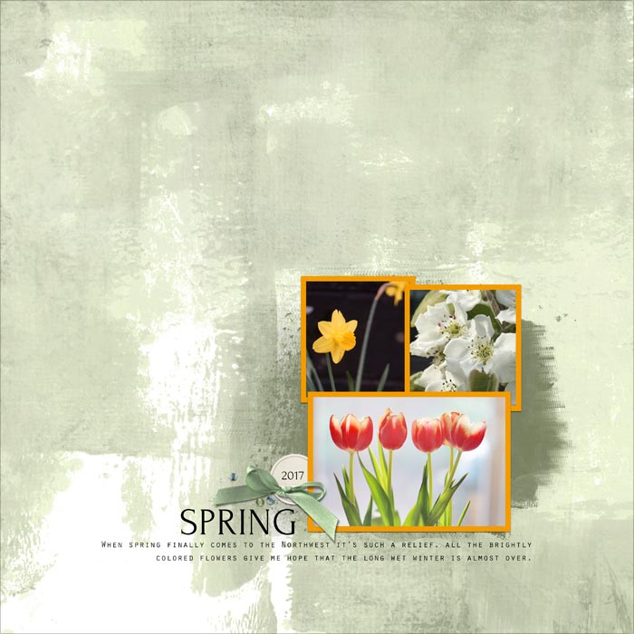
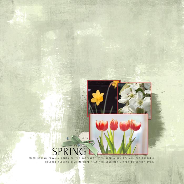
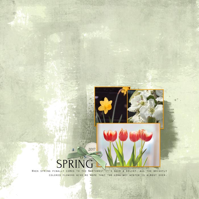
Below are a number of stroke possibilities, both for size and color. (I sampled the colors from the photos.) How well do each of following images adhere to this standard? Which one would you choose for these photos?
MY FINAL THOUGHTS
Here’s the image I chose as giving the best answer to the question: Does my choice of stroke size and color draw attention to the photo instead of the stroke?

The size of the stroke is 10 px. I always include a drop shadow along with a stroke layer style.
What About Colored Strokes?
Using a color from a photo as the stroke color seems like a reasonable thing to do, but the problem is that it rarely looks good because it often draws too much attention to itself.

Or it doesn’t draw enough attention to make the photos pop, or just seems a bit odd or unexpected.

The standard color used by most designers is white because it doesn’t attract as much attention to itself, yet it makes the photos stand out from the background. A white stroke generally looks more understated and realistic. After all, in the early days paper photos all had white edges, and that’s what we tend to expect on digital photos.
Does that mean you can never use color? Not at all. Color sometimes works, but until you feel really confident in your design skills, I recommend staying away from color. White is always a safe choice.
Vary The Stroke Size
The stroke size can vary depending on the size of the photo.
You can also use larger strokes. Here is my page with 20 px strokes. I could easily use this size for these photos.

Here’s the page using a 30 px stroke. Any of these three stroke sizes of white strokes would look fine, but because these photos are small, I would personally use either the 10 or 20 px strokes. The larger the photo, the larger you can make the stroke.

Here’s my finished page where I hid the drop shadow on one photo and added a custom drop shadow.

Take Away
- When photos in a cluster aren’t well defined, a white stroke outline is a great way to make each individual photo show up clearly. Match the size of the stroke to the photo(s).
- Stroke outlines are good for making photos “pop out” from the background of your page.
- It’s generally best to avoid colored strokes.

Credits
Photos and page by Linda Sattgast
Template: Design Beautiful Pages
Kit: Farmhouse Style by Melissa Renfro
Mask: Indispensable by Jopke Digital Art
Font: Orator Std and Forum (title)
Brought to you by Linda Sattgast


