Test Your Skills 2
Test Your Skills
Quiz: What Makes A Designing In Thirds Page?
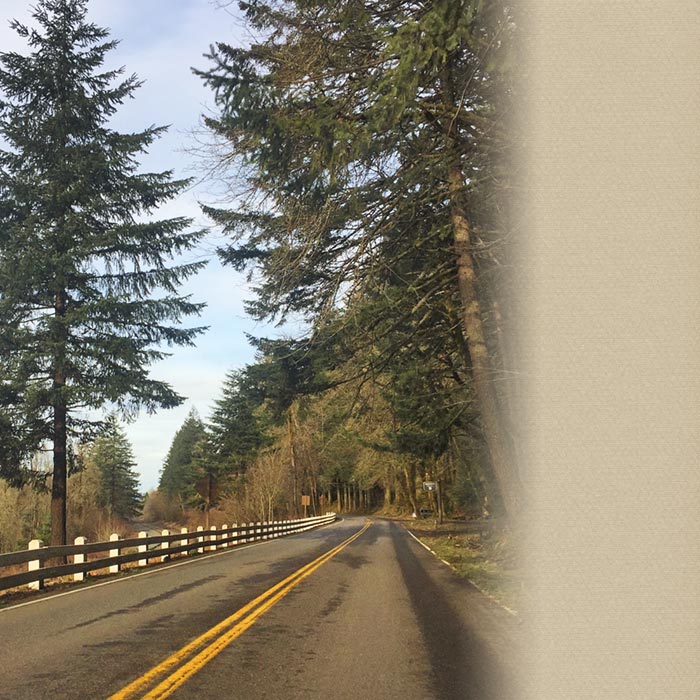
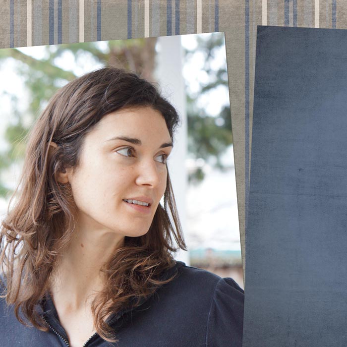
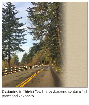
Designing in thirds pages are a versatile group, but what binds them together as a design is the one-third/two-thirds background. So, to identify a Designing In Thirds page, look at the background.
Here are the four background possibilities to look for:
- Two-thirds photo and one-third paper (classic)
- Two-thirds paper and one-third photo (used less often, but can be striking!)
- Two-thirds paper1 and one-third paper2 (often combines plain with patterned paper)
- Two-thirds photo1 and one-third photo2 (rare—hard to pull off well.)
Challenge!
Look at each of the following page backgrounds and decide if it’s a Designing In Thirds page.
Click on thumbnails below to see larger images and credits
Check your Answers
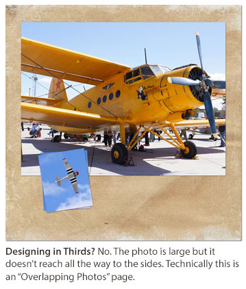
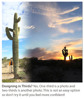
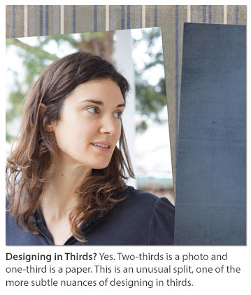
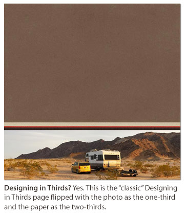
Digging Deeper
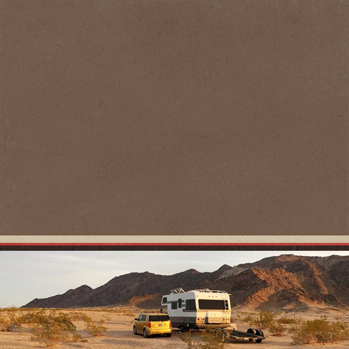
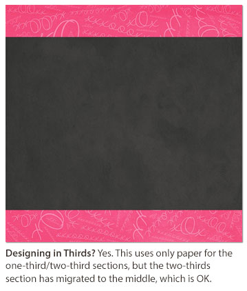
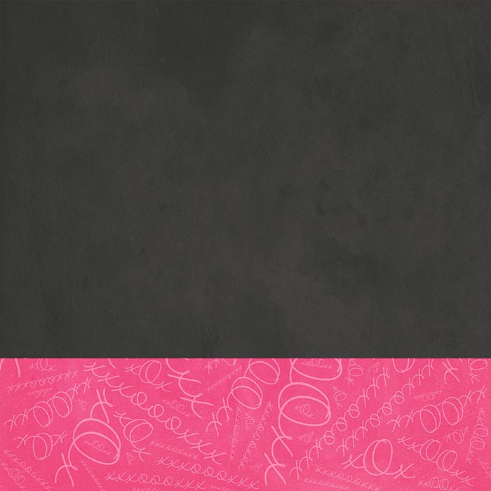
Let’s take a closer look at the last example. Here’s how the template started—a one-third/two-thirds page with both sections filled with paper.
I decided to move the larger section to the middle. Is that OK? Yes! It’s still two-thirds of the page, just in a different location. Since the two sections aren’t “classically” orientated, it may be a little harder to recognize the Designing In Thirds background.
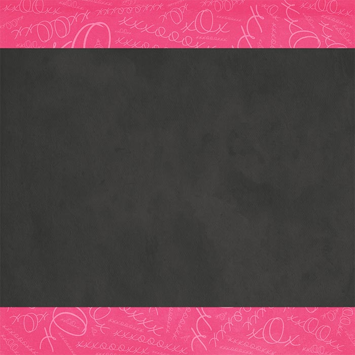
Remember, if you don’t feel comfortable with the more subtle Designing In Thirds backgrounds, stick with the tried and true easy-to-recognize backgrounds!
TAKE THE YES OR NO CHALLENGE
Yes or No?
If I add a photo to this page, does that change the page design?
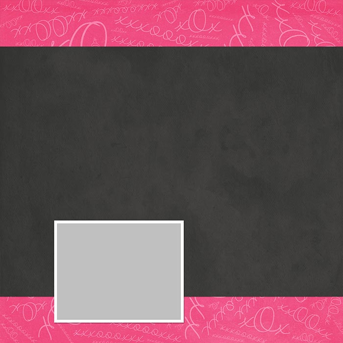
No. It’s still a Designing In Thirds page design.
If, instead of one photo, I add a lot of photos, does that change the page design?
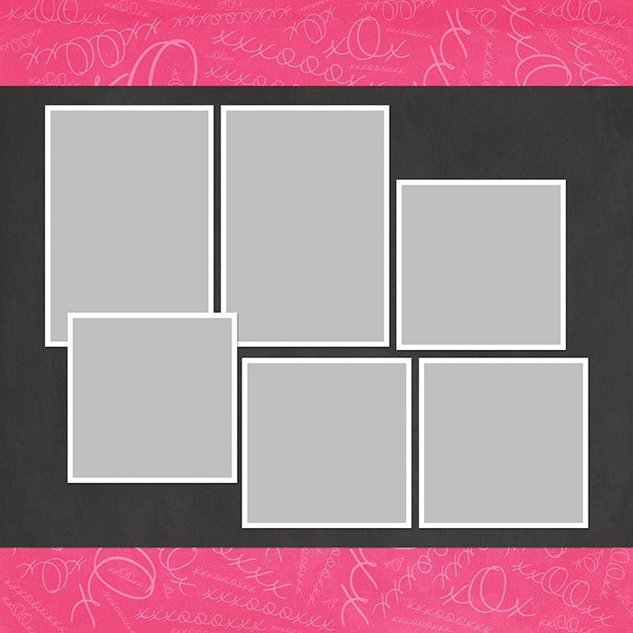
No. It’s still a Designing In Thirds page design. BUT you’ve combined it with a different style of photo design. That’s perfectly fine. If you like to scrap with lots of photos, you can combine another photo arrangement with a Designing In Thirds background.
What happens to the Designing in Thirds design when I add elements?
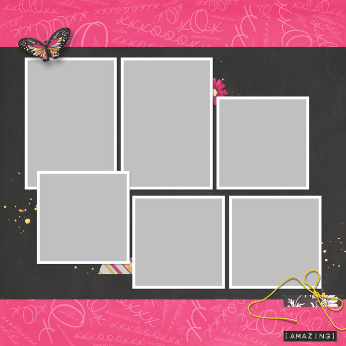
Nothing. Photos and elements do not affect a Designing In Thirds background. Naturally you’ll want to place photos and elements effectively on your page, using good design principles. (Be sure to watch the Finishing Touches video for each design to get great ideas for good element placement!)
Does it matter if I add a mask behind the two-thirds paper?
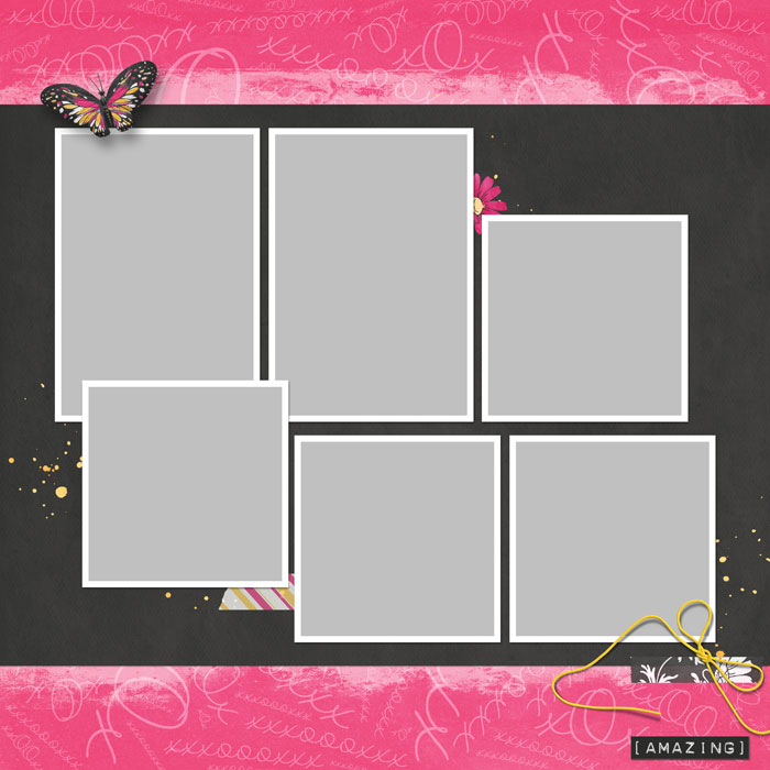
Nope. Not a bit.
Here’s my finished page. It’s a Designing In Thirds page (because of the background) combined with another style of photo arrangement.
It’s not “classic Designing In Thirds,” but it does fit within the Designing In Thirds guidelines.
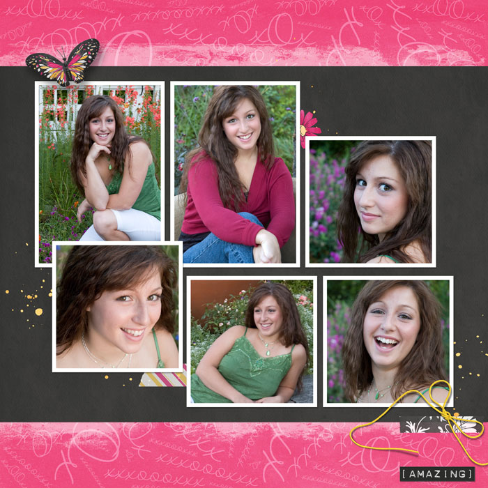
Now it’s time for YOU to give it a try! Choose a style and go for it!

Credits
Photos by Linda Sattgast
Kit from XOX by Brandy Murry
Mask from Design Beautiful Pages
Brought to you by Linda Sattgast
