Test Your Skills 3
Test Your Skills
Quiz: Designing In Thirds Finishing Touches
In the last challenge you looked at a series of images to determine if they were Designing In Thirds pages. I’m using the same images for this challenge, but ALL the pages are now Designing In Thirds.
Can you spot which page(s) are “classic” Designing In Thirds? Which pages would look best with a ribbon or paper strip that goes from one side of the page to the other at the 1/3 2/3 division?
Click on thumbnails below to see larger images and credits
Check your Answers


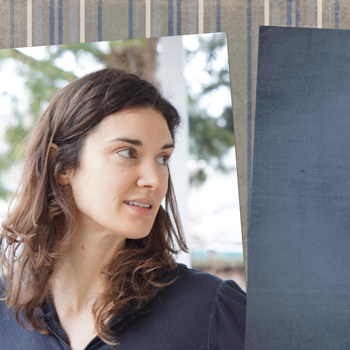
Classic Designing In Thirds pages have a clear 1/3 2/3 background division that’s either filled with a photo or with paper. The division between the two parts is sharp and well-defined. Almost without exception “classic” Designing In Thirds scrapbook pages use a ribbon or paper strip to cover the dividing line for a less abrupt and more pleasing transition from one section to the other.
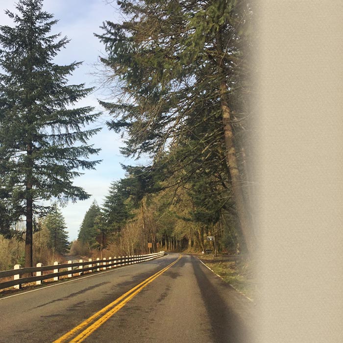
Some advanced Designing In Thirds scrapbook pages may also benefit from a ribbon or paper strip IF the transition edges are sharp and well-defined. Since advanced Designing In Thirds pages have parts that move around a bit more, there’s enough interest that you may not need to add a ribbon, like this image:

Or you may soften the edge with a mask overlay, like this image:
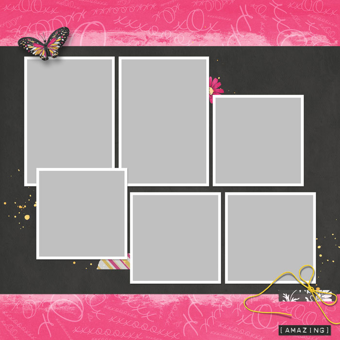
OR you can add one or more ribbons or paper strips along one or both edges, like this image:

Are you ready for another challenge? If so, click the button below.
Finishing Touches CHALLENGE
Let’s choose one page and finish it. I’ve chosen a classic Designing In Thirds page of boondocking in the desert. Boondocking means you camp in an RV without hookups for water and sewer. People who want to see more of nature in a less crowded area enjoy this kind of camping. That’s the kind of RV camping Charlie and I usually do, especially for extended getaways.

I’ve already added some paper strips to my classic Designing In Thirds page. What else could you add to make the page look finished? (Hint: The Designing In Thirds classroom has some great ideas!)
SEE THE SOURCE OF MY IDEA
I went to the Finishing Touches page in the classroom and looked at the sample page images for inspiration. I decided this example of finishing touches would look good with my page.
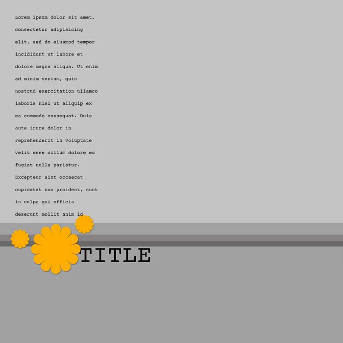
If you haven’t been using the Finishing Touches page, you’re missing out. It’s a gold mine of ideas for the placement of elements, title, and journaling! The Finishing Touches page isn’t just a repeat of a prior lesson. The examples are specifically for the featured design, and they take into account the 7 Design Principles that apply to every design.
Armed with this information, I finished my page.
SEE MY FINISHED PAGE
When you get ideas for a finished page, you don’t have to follow the example exactly, but the ideas give you a starting point.

Here’s what I did:
- I flipped the design, putting the journaling and title on the right instead of the left.
- I placed the title above the paper strips instead of below them.
- Putting the title above the paper strips introduced some trapped space in that area, so I added some paint scatter.
- Just a little bit of scatter makes this space look intentional. If the paint doesn’t fill a space exactly as you want it to, you can change the Foreground Color Chip to the color of your paint and use the Brush tool to add some paint here and there, which is what I did.
- The flowers in the Finishing Touches examples are just placeholders for whatever element you want to use. Since flowers didn’t fit my topic, I opted for a very simple look. I used a couple pieces of tape and the paint scatter element.
- I also blended two elements into the upper paper background—some scattered letters and a sun ray.
Takeaway:
When you’re ready to add journaling and elements, check out the ideas on the Finishing Touches page (or the Finishing Touches downloadable PDF). These ideas already follow the 7 Design Principles, so they’ll make your page look great!
If you have other ideas for finishing your page, go for it. Just remember to use the 7 Design Principles.

Credits
Desert Boondocking
Photo and page by Linda Sattgast
Kits: Nature’s Playground by Kim Broedelet and XOX by Brandy Murry, sun ray by Linda Sattgast
Fonts: Orator Std and Valley
Brought to you by Linda Sattgast
