Test Your Skills4
Test Your Skills
Quiz: Try On Some Titles
In this challenge we’re going to explore the versatility of titles. It’s possible to get stuck with tunnel vision when it comes to titles, so let’s take off the blinders and expand the number of possibilities for creating a great title!
Here’s the page that needs a title:

Credits
Photos and page by Linda Sattgast
Kit: Rosehill Cottage by Cindy Rohrbough
Challenge: Before moving on, think about some title possibilities:
- What title would you use for this page?
- Where would you put the title? Why?
- What font would you use?
- What should you consider when deciding where to place your title?
SEE TITLE #1
Here’s my first try at a title.
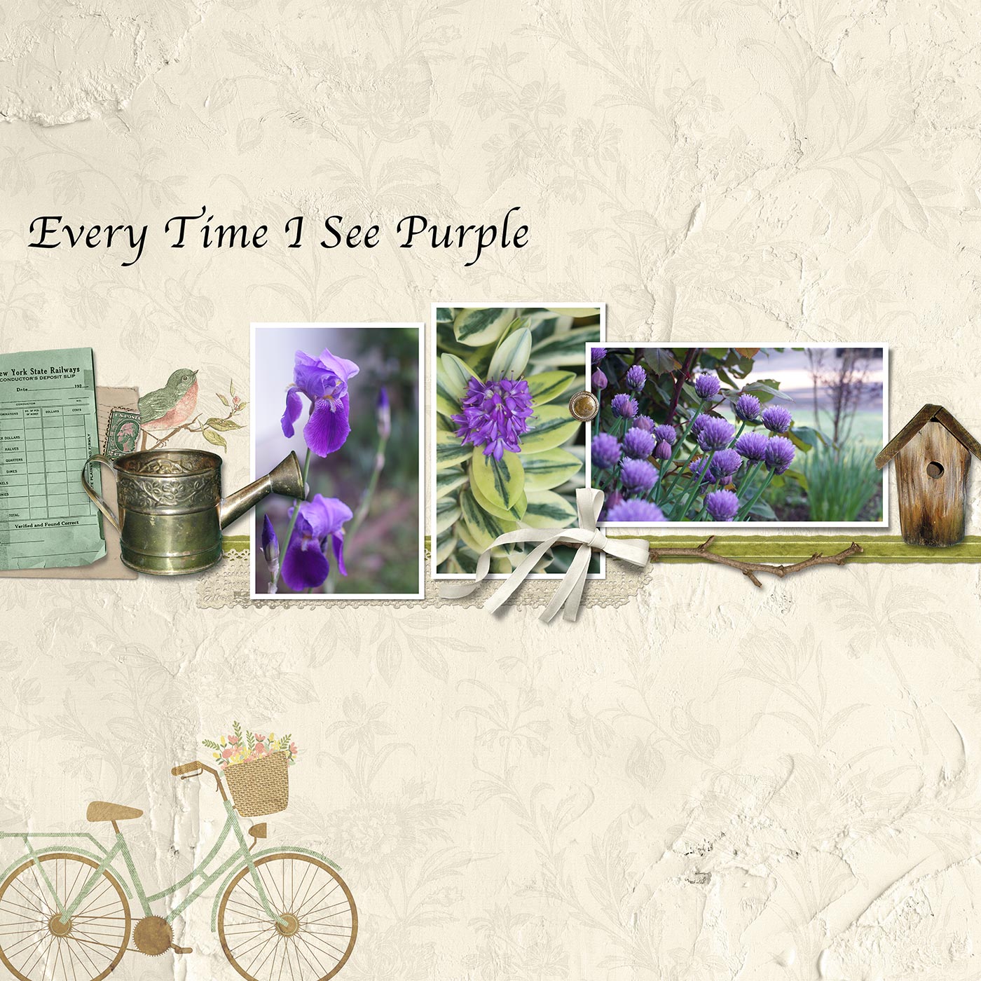
Font: Apple Chancery
This may seem like a strange title, but here’s the back story:
Years ago I had written a set of four small children’s picture books and was collaborating with an artist friend on a mockup for a publisher. I wanted one of the covers to have purple as the background color but he disagreed saying, “You rarely see purple in nature.” So we didn’t use purple in the mockup.
The publisher did decide to publish the set of little books, and wouldn’t you know—they used purple as one of the background colors! Since then I’ve often seen purple in nature—in the sky, flowers, leaves, and elsewhere, and when I see it I say to myself, tongue-in-cheek, “Of course, it’s rare to see purple in nature!”
Challenge: Critique the design of the title and decide why you would or wouldn’t use this design.
SEE MY CRITIQUE
I would not use this design.
- It is one long line, which rarely looks good.
- It uses an outdated calligraphy font (Apple Chancery).
- It’s randomly placed and, even though it’s fairly close to the left edge of the page, it doesn’t feel connected to it.
- The position of the title creates trapped space between it and the line of photos and elements below it.
Let’s try a different title design.
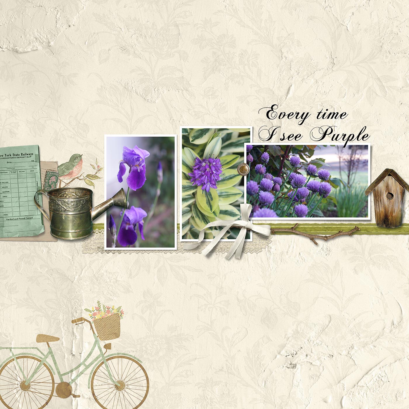
Font: Chopin Script
Challenge: What are your thoughts about the second title?
SEE MY CRITIQUE
The second title is better.
- The font is better.
- The title is divided into two lines. Yes, you can divide a title up to make it fit better!
- It’s connected to the line of photos in a logical way.
BUT
- Big No-No: the title (2D) is over the photo (3D).
- If the title is longer than 3 words or so, the fancy font can feel a bit overwhelming, which I think is the case here. It’s too much of a good thing.
So let’s try another title design:

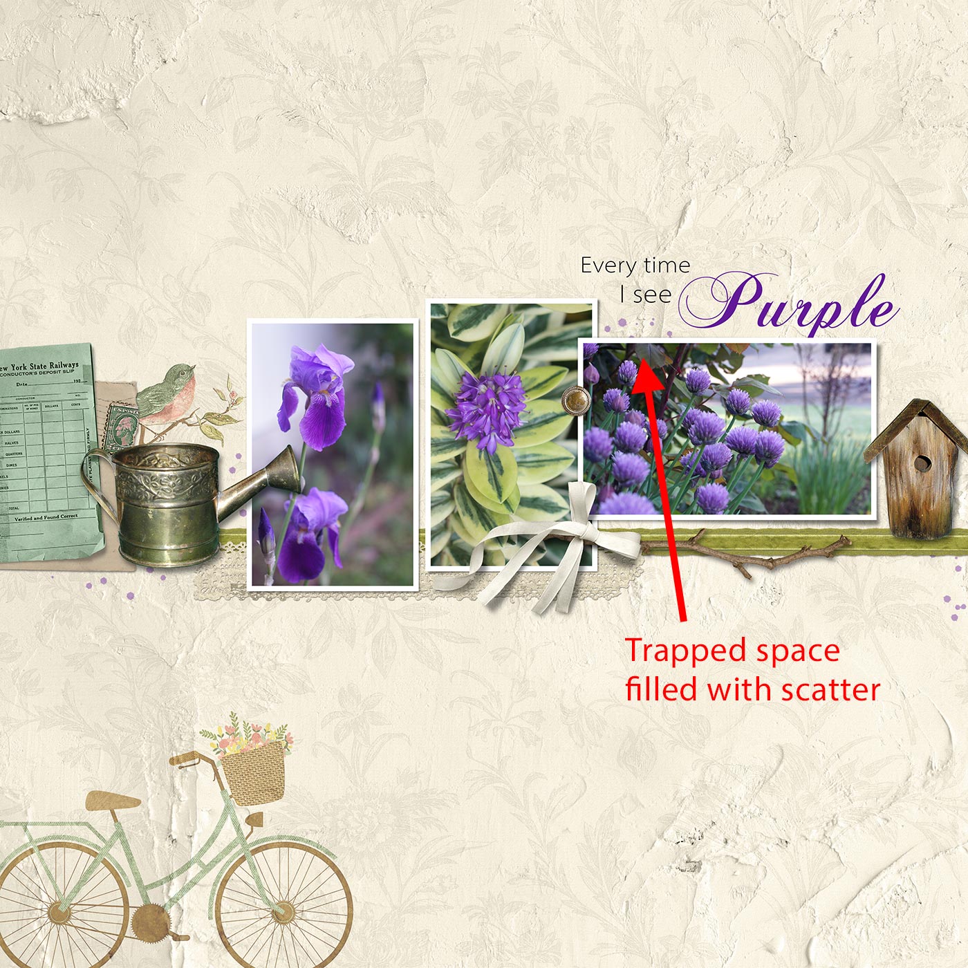
Fonts: Myriad Pro and Chopin Script
Challenge: What do you think? Is it a keeper or not?
SEE MY CRITIQUE
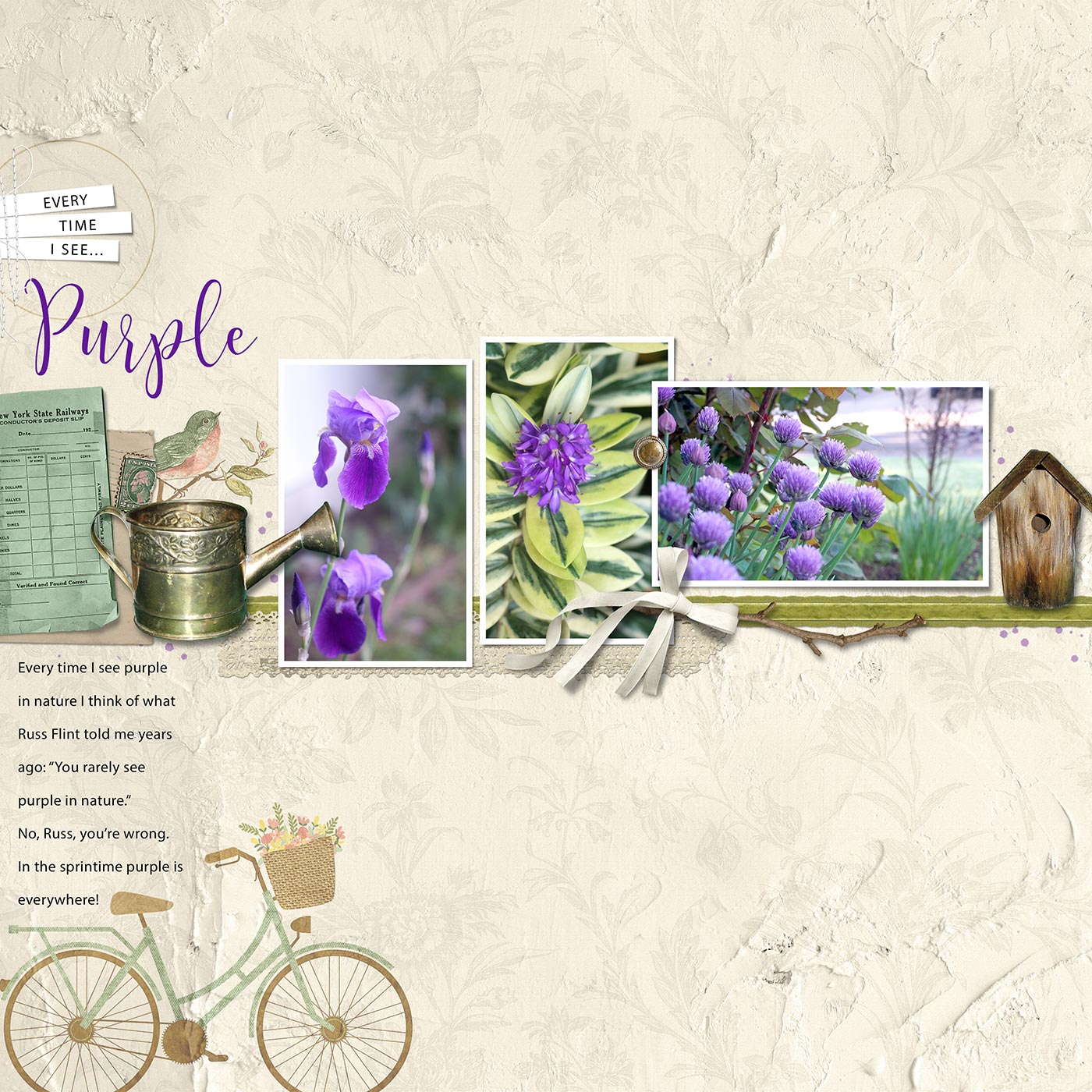
The third title is a HUGE improvement!
- It combines two fonts and uses the fancy font for the most important word in the title.
- It creates a sort of shape with the way the lines of type are stacked.
- The word “Purple” is purple, which works well in this case.
- The word “Purple” is below the 3D photo. Even though the descender letter “p” is covered up slightly, you can tell what the word is without any problem.
BUT
Do you see the trapped space? What would you do about that?
HERE’S WHAT I DID
I added some light purple scatter several places on the page, including the trapped space, to fill it in so it wouldn’t look like empty space.
Think Outside The Box
There are LOTS of possibilities when it comes to titles:
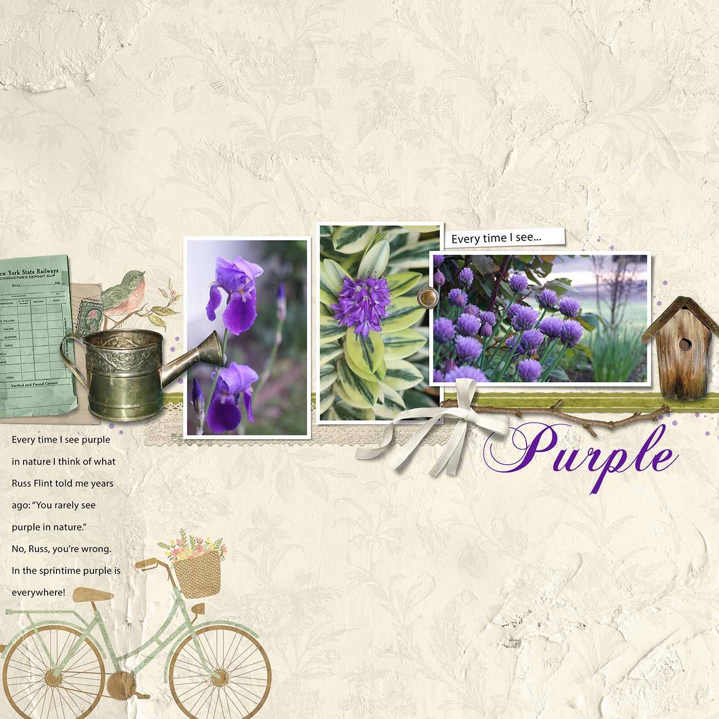
Change The Title
I often change the entire title or adjust one or more words in a title to fit my page design better. Below I added one more phrase (in nature…) and that allowed the word “Purple” to be completely visible.
In this version I also added journaling on the left to explain the story behind the page. (Don’t look now, but there’s a misspelled word in the journaling. I’ll fix it later…)

Move The Title
You can move the title or move one word in the title to a place on your page where it fits better. In the image below I moved the word “Purple” below the line of photos and elements and put a twig element in the space above it to avoid trapped space. Don’t forget you can also use journaling strips as part of your title, as I’ve done here. However, I must admit that I like the previous title better than this one.
There’s something else you need to consider when placing your title. What do you think it is?
CLICK HERE TO FIND OUT
You need to consider the Flow of the page. The above title is technically correct, but, in my opinion, it puts too much weight on the lower half of the page.
So I decided to try an intersecting line on the left. The line of photos and elements intersects with this line like a “T.”
Fonts: Myriad Pro and Caleigh
Adjust Elements To The Title
Notice how well the word “Purple” fits with the elements below it. Although I didn’t plan this in advance, adjusting the elements around a fancy font is one way to make it fit.
As a whole, I really like the way this title design interacts with the page.
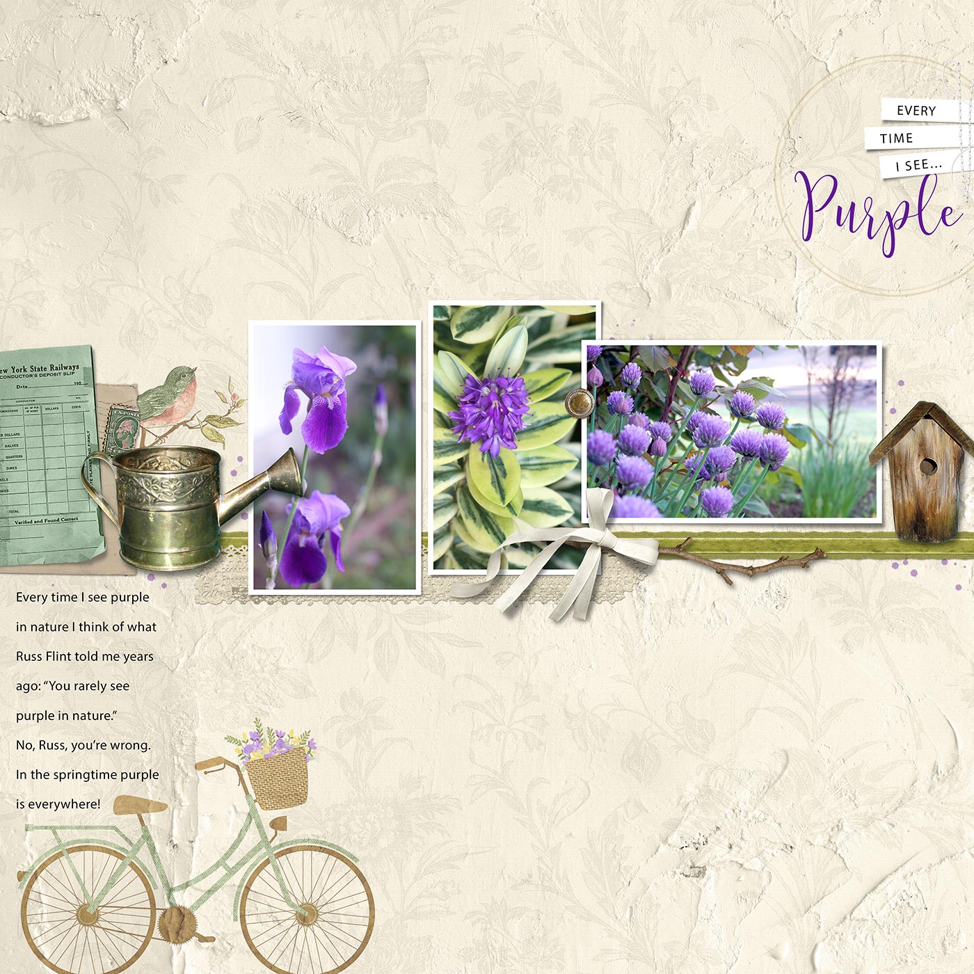
Choosing A Flow
Here’s one more title placement. Since there was a bicycle in the lower left corner I decided to place the title in the upper right to form a diagonal flow. Placing a 2D circle element around the title drew attention to it and was a repetition of the two bicycle wheel shapes.
I then made my final adjustments, including spell checking. At Charlie's suggestion I changed the color of the flowers in the bicycle basket from peach to purple. This increased the repetition of purple on my page, emphasized the diagonal flow, and reinforced the point of the page—that purple is a fairly common color!
Credits
Photos and page by Linda Sattgast
Kit: Rosehill Cottage by Cindy Rohrbough
Stitching from All Stitched Up by Susie Roberts
Fonts: Myriad Pro, Caleigh
Conclusion
I could have chosen several of the title possibilities I showed you and the page would have been fine, so don’t limit yourself to the same method you’ve used forever. Mix it up a bit!

- Break the title up into more than one line to make it fit better.
- When you have a longish title, use two contrasting fonts—a regular journaling font and a fancier font to add punch to the one or two most important words in the title. The fancy font is usually much larger than the journaling font.
- Try placing the title in different locations on your page to see where it fits best.
- Remember the principle of Proximity. Keep the title connected with a focal point on your page.
- If the title creates trapped space you can change the font OR add an element to fill the space OR reposition elements already on your page to remove the trapped space.
- Be willing to change one or more words in the title or create a completely new title so it fits better.
- Remember the principle of Flow when placing your title. Decide what flow you want and use your title to emphasize that flow.
Have fun experimenting with new title possibilities!
Brought to you by Linda Sattgast